Sweet Haven is a concept brand I designed to showcase and enhance my skills in visual identity creation, inspired by a brand brief generated by ChatGPT.
The Brand Brief
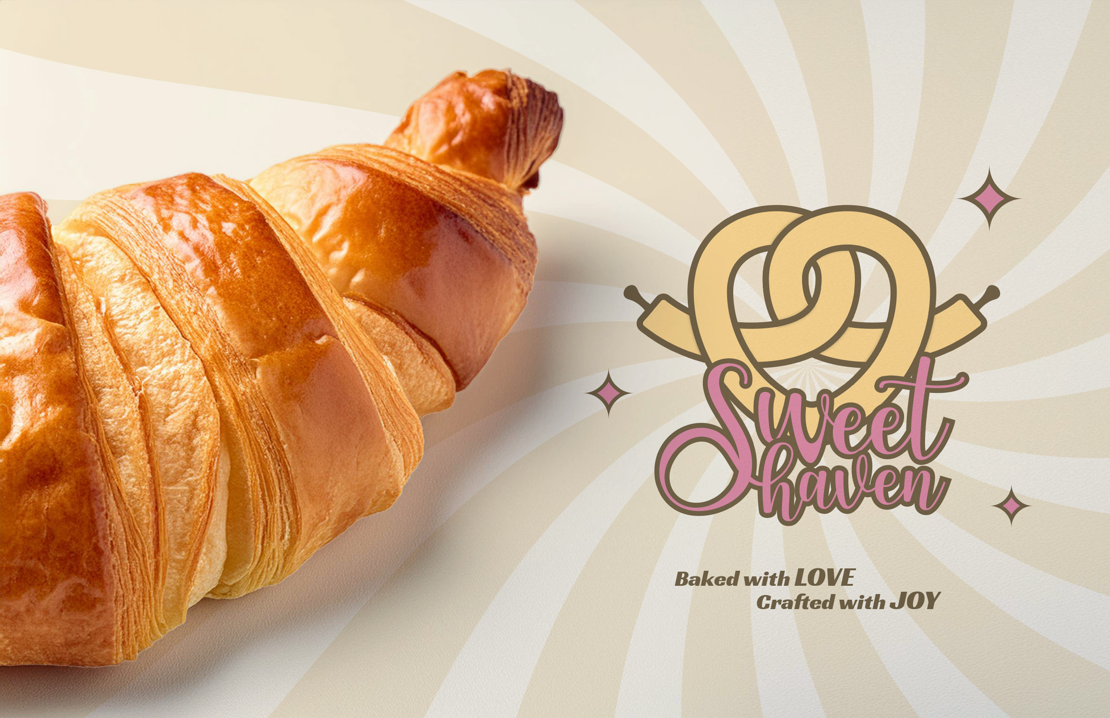
1. Introduction - Sweet Haven Bakery is a boutique bakery dedicated to creating delectable and delightful baked goods that evoke a sense of warmth and joy. Our mission is to be the go-to destination for those seeking high-quality, artisanal treats in a cozy and inviting atmosphere. Our tagline is "Baked with love. Crafted with joy."
2. Brand Personality -
2.1 Warm: Approachable, friendly, and welcoming.
2.2 Nostalgic: Evoking memories of homemade treats and cherished family moments.
2.3 Artisanal: Handcrafted, high-quality ingredients, and attention to detail.
2.1 Warm: Approachable, friendly, and welcoming.
2.2 Nostalgic: Evoking memories of homemade treats and cherished family moments.
2.3 Artisanal: Handcrafted, high-quality ingredients, and attention to detail.
3. Target Audience - Our primary audience includes individuals with a sweet tooth, families looking for special treats, and those who appreciate the artistry and authenticity of handcrafted baked goods.
4. Deliverables -
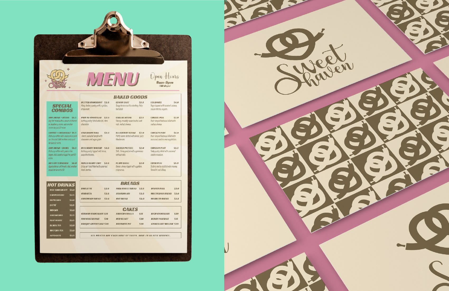
4.1 Brand Logo - A whimsical yet elegant logo that incorporates a rolling pin and a heart
4.2 Visual Identity - A design that feels approachable and nostalgic while highlighting the high-quality goods we offer.
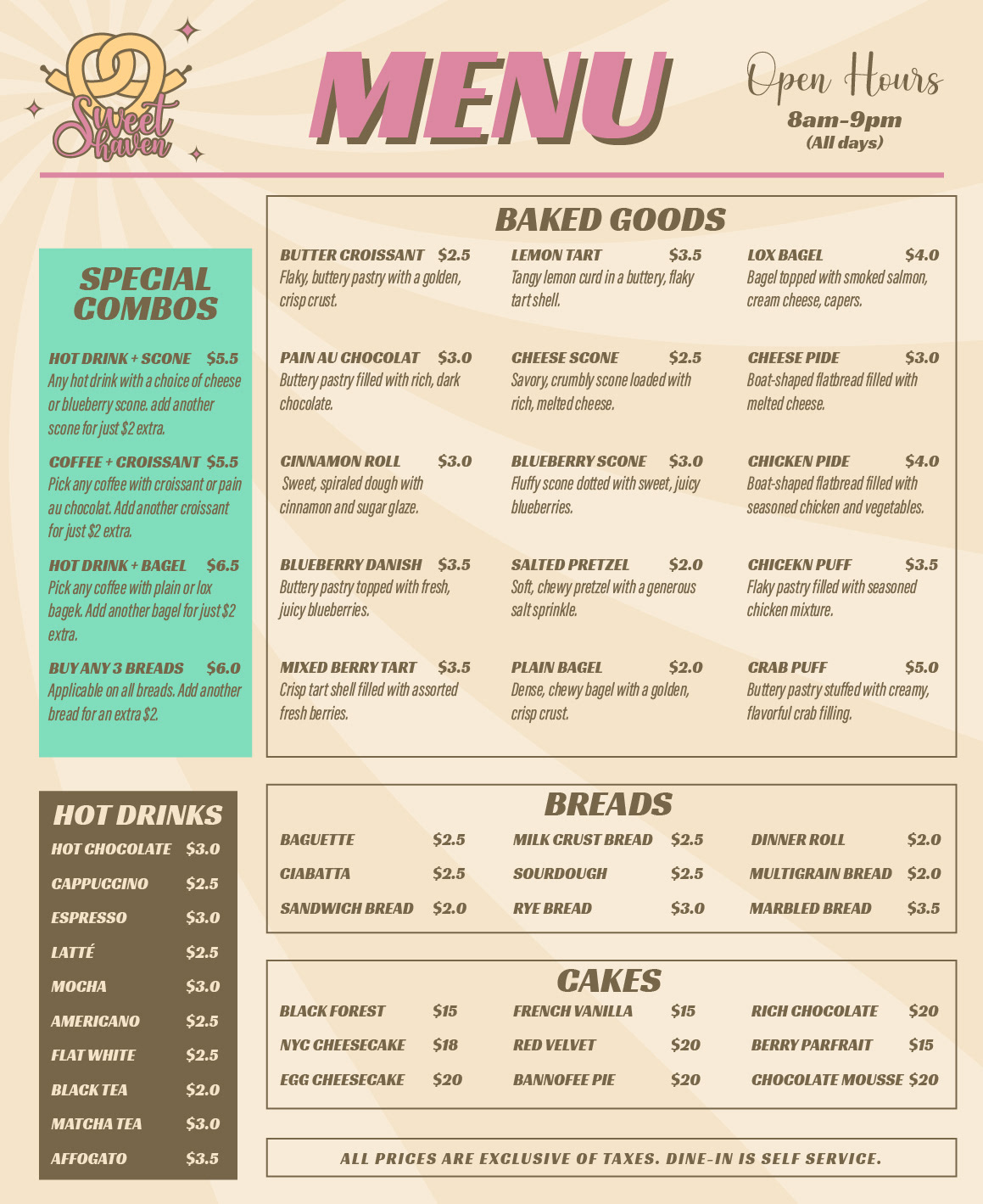
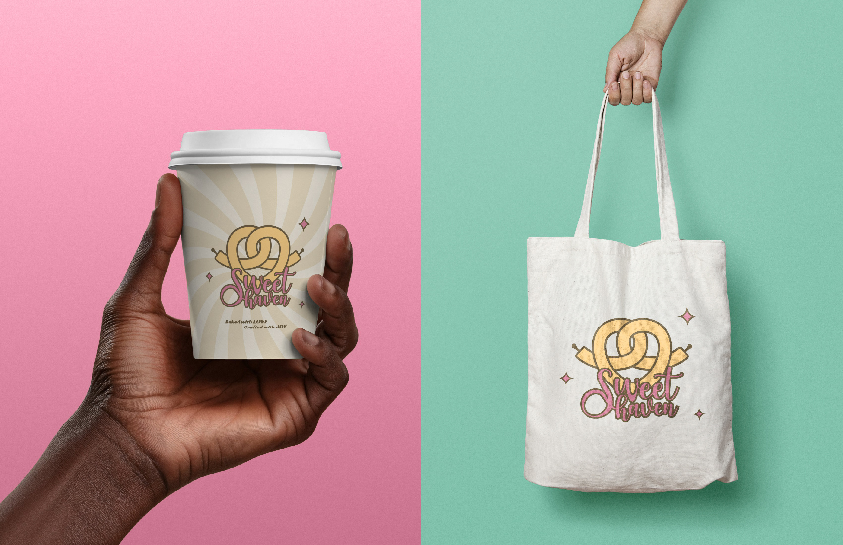
4.3 Touchpoints - Brand packaging and menu.
4.1 Brand Logo - A whimsical yet elegant logo that incorporates a rolling pin and a heart
4.2 Visual Identity - A design that feels approachable and nostalgic while highlighting the high-quality goods we offer.
4.3 Touchpoints - Brand packaging and menu.
Initial Observations
My first impression of the brand brief was that it wasn’t very detailed. However, with ChatGPT, that's not an issue, I can easily ask for a more detailed brief, and it’ll generate one for me. This is similar to how I work with my clients, encouraging them to think deeply about their brand and communicate what they want to convey to their customers.
That said, from experience, I know not every client can clearly express their ideas or vision. In that sense, working with a less detailed brief made this project feel more realistic and gave me the freedom to explore creative design choices.
Another observation I had is that creating a sense of nostalgia can be tricky, as it’s a highly subjective feeling. What feels nostalgic to one person might be completely different for someone else, especially depending on their age or life experiences. For this reason, I decided to focus solely on the target audience for the brand, although even that can vary significantly.
Gathering Inspiration
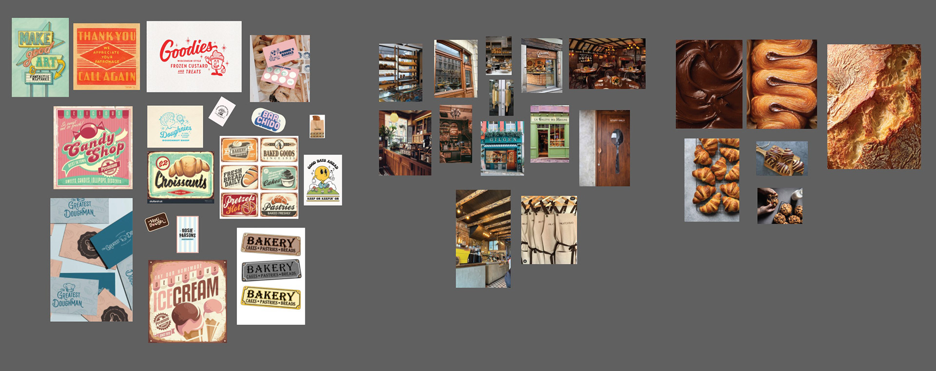
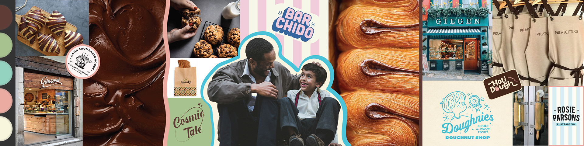
The first step in my process is usually gathering inspiration from the internet. This helps me mentally map out a direction for the brand and keeps me from aimlessly scrolling online.
I typically look for inspiration in categories like signage, fonts, textures, photos, graphics, interiors, and even people. However, the kinds of inspiration I seek can vary depending on the project. Throughout this process, my focus has been on visuals that communicate warm, nostalgic, and artisanal, as those qualities align with the essence of this brand.
Once I’ve collected everything, I go through the images (or any other assets), remove the ones that don’t fit my vision, and then organize the rest into categories.
Below is a screenshot of my Illustrator file for this project after sorting and categorizing all the images and below that is the stylescape that I had created for the brand.
Now, of course, at this stage of the project, I would typically require approval from my client, and there may be some changes required. However, since there is no real client and this is just a concept, I move on to the next part.
Creating the Logo
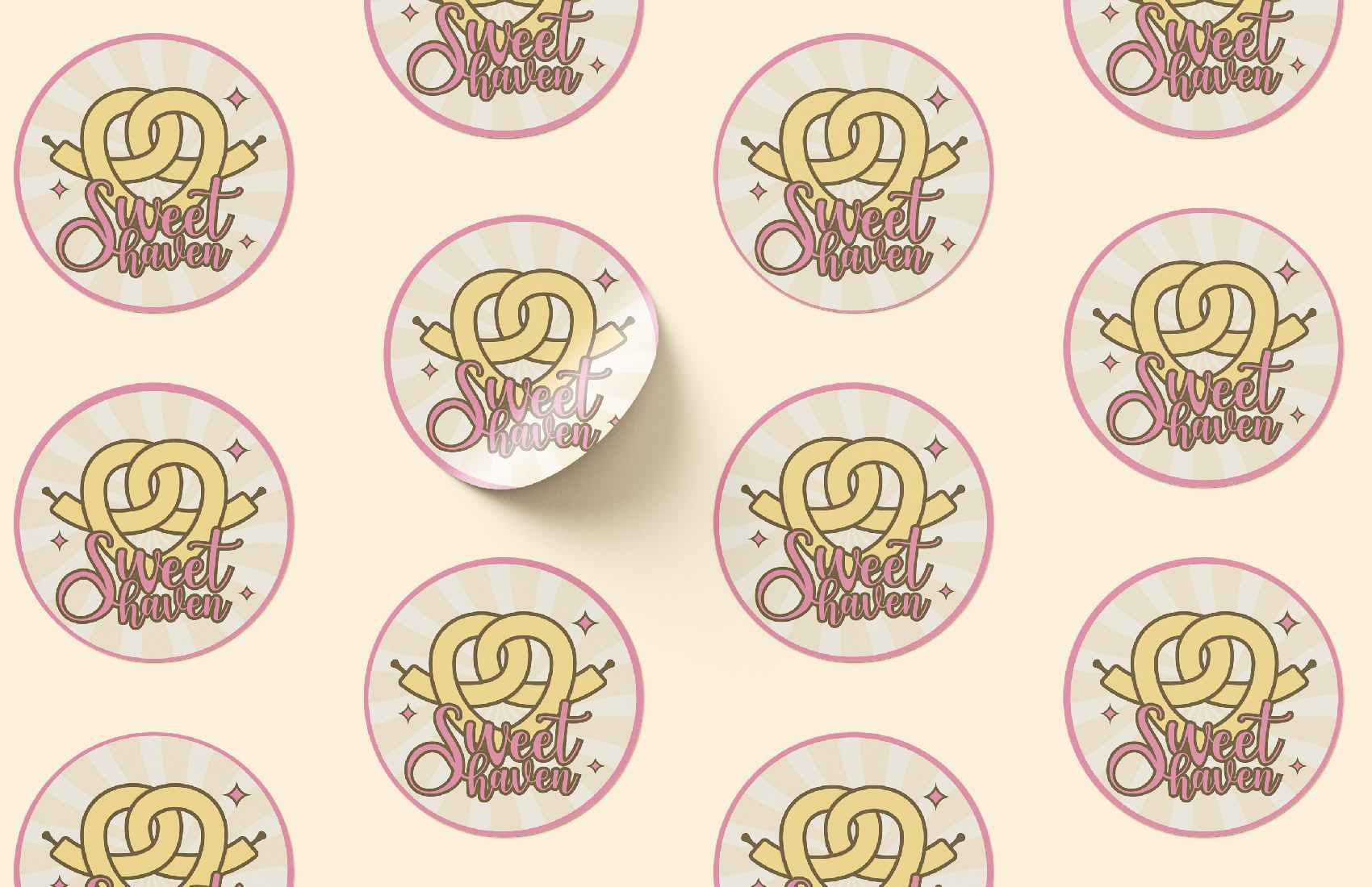
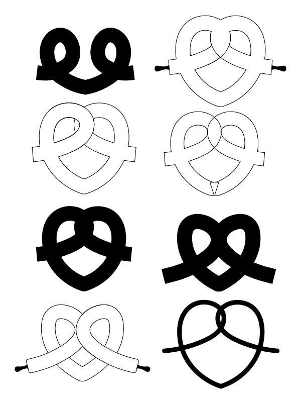
To create the logo, I initially came up with a few concepts in Illustrator. However, one concept felt particularly fitting for this brand. Since the logo needed to include a rolling pin and a heart, my idea was to design a rolling pin in the shape of a heart. To align with the bakery theme, I decided to intertwine the heart shape to resemble a pretzel.
While I had the idea and vision, bringing this logo to life proved to be a bit tricky. The thickness and curves required careful attention to detail. If it was too thick, the intertwining effect wouldn’t be visible, and if it was too thin, it wouldn’t look like a pretzel.
Eventually, I was able to get the proportions just right and achieved a result I was very pleased with.
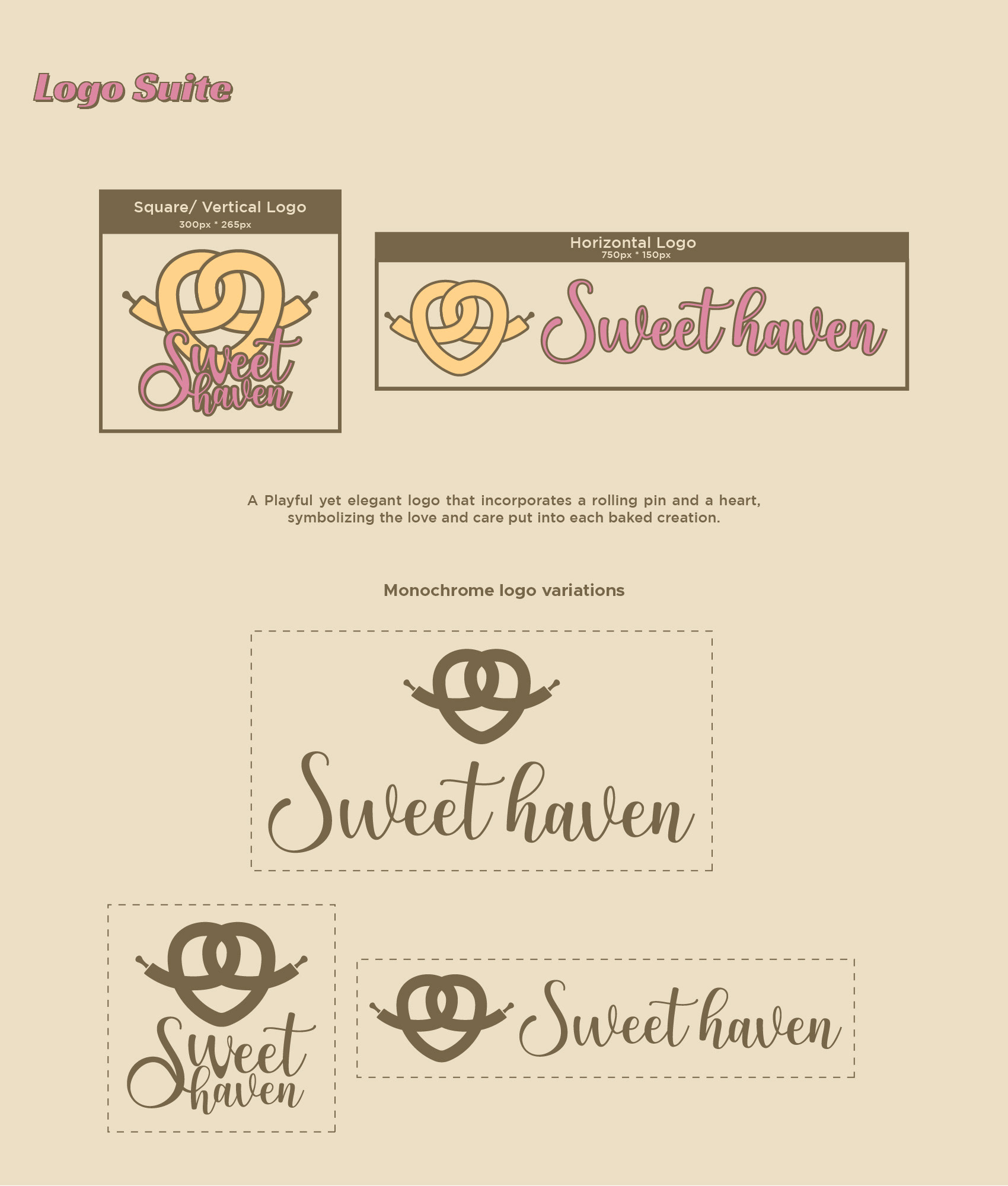
I ended up creating two versions of the logo. The reason for this was my belief that logos should not be overly detailed, as it can interfere with their scalability and print-ability on smaller surfaces.
But the thick outlines around the shape were essential to add balance and emphasize the intertwining element of the design. Without them, it might have been difficult to clearly identify the object depicted in the logo.
To address these concerns, I decided to create a more minimal version of the logo, ensuring it would work well across various applications and sizes.
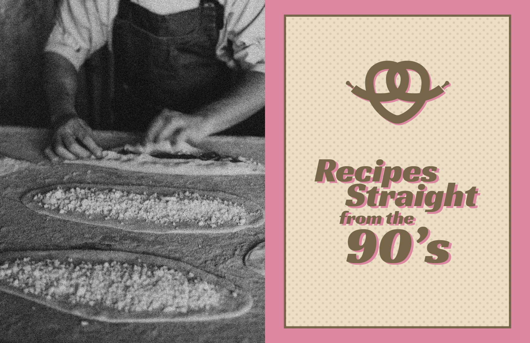
Brand Typography
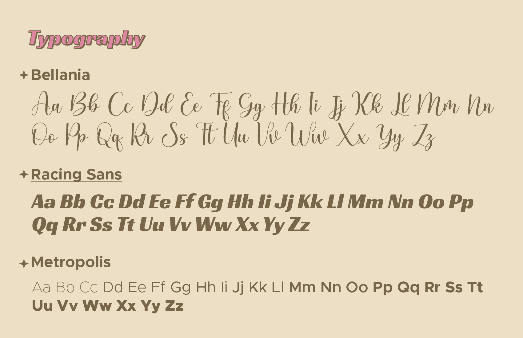
For the brand typography, I chose the following fonts:
Bellania as the display font. I felt its playful yet delicate script style perfectly complements the overall feel I want to achieve for the brand.
Racing Sans as the title font. This one is harder to describe—it gives me a vintage, retro vibe, though I can’t quite pinpoint why.
Metropolis for the body font. It’s clean, versatile, and easy to read. For body fonts, I usually prefer something simple and straightforward, and Metropolis fits that perfectly.
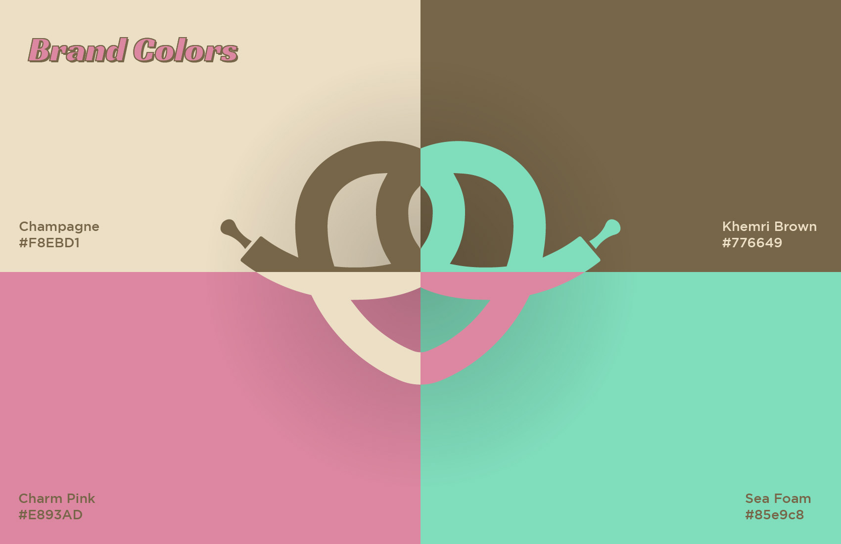
Brand Colours
For the brand colors, I decided to limit the palette to just four. This decision was intentional, as a limited color palette ensures consistency across various applications and helps maintain a cohesive visual identity.
Champagne: A soft, neutral base that feels warm and inviting, adding to the nostalgic vibe of the brand while keeping it approachable.
Khemri Brown: An earthy tone that conveys warmth and ties directly to the artisanal, handcrafted feel of baked goods.
Charm Pink: A playful, vintage-inspired color that adds personality and charm, evoking the nostalgia of old-fashioned bakeries.
Sea Foam: A fresh, contrasting tone that brings balance to the palette, adding a modern touch while complementing the retro aesthetic.
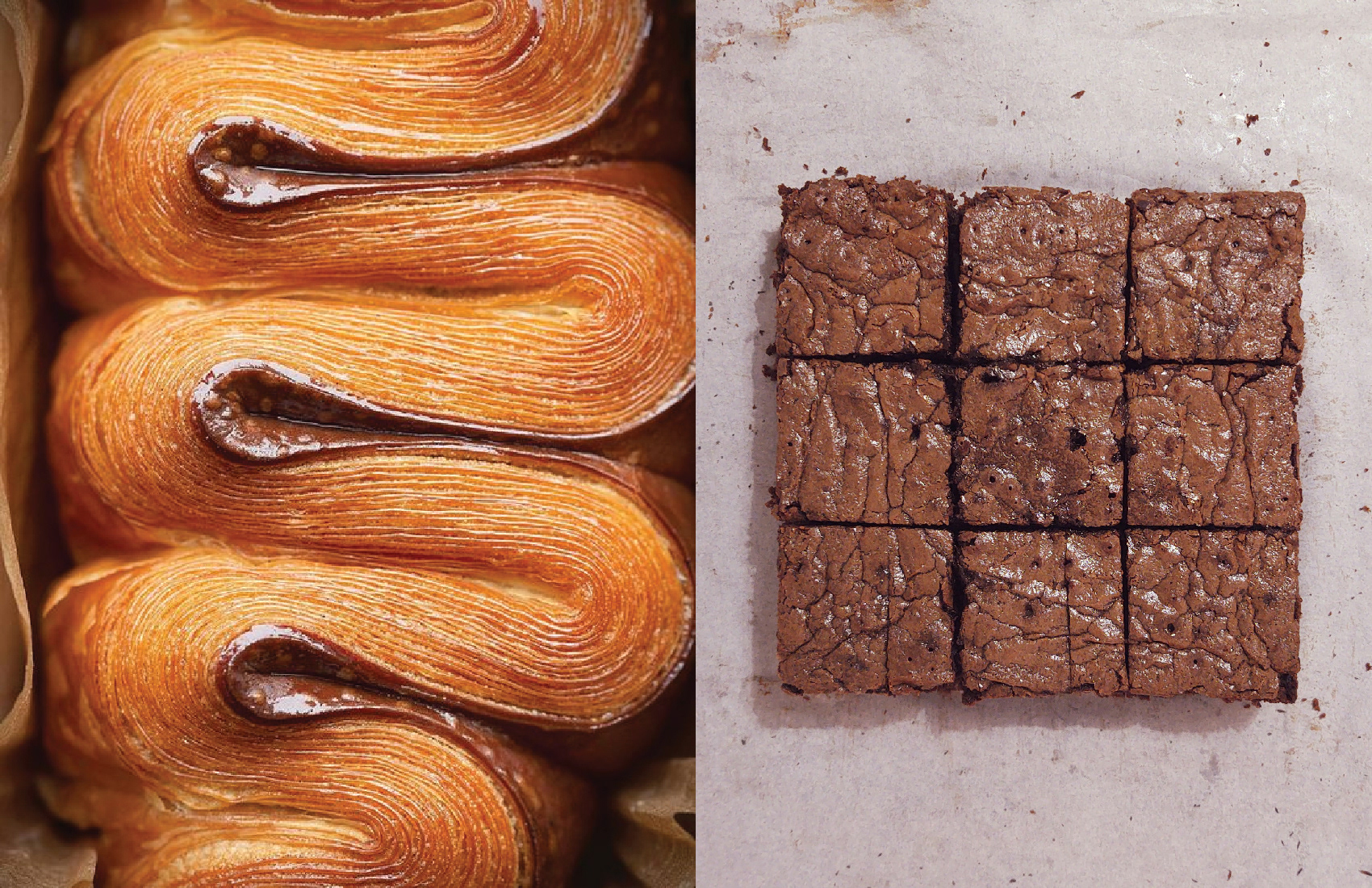
Brand Photography
For the brand photography, my focus is on highlighting the textures of the baked goods. I believe that textures tell the full story about the quality of baked goods. They convey freshness, craftsmanship, and attention to detail.
Additionally, these textures are visually appealing and can evoke a sense of warmth and indulgence, which aligns perfectly with the brand's nostalgic and artisanal identity.
Final Thoughts
Working on this project was incredibly rewarding and fun. It gave me the chance to refine my skills in creating a cohesive visual identity while balancing creative freedom with a focus on the target audience.
I learned the value of simplicity and adaptability in design, especially for scalability and usability. This process reminded me why I love brand creation. It’s a perfect mix of problem-solving, storytelling, and creativity.
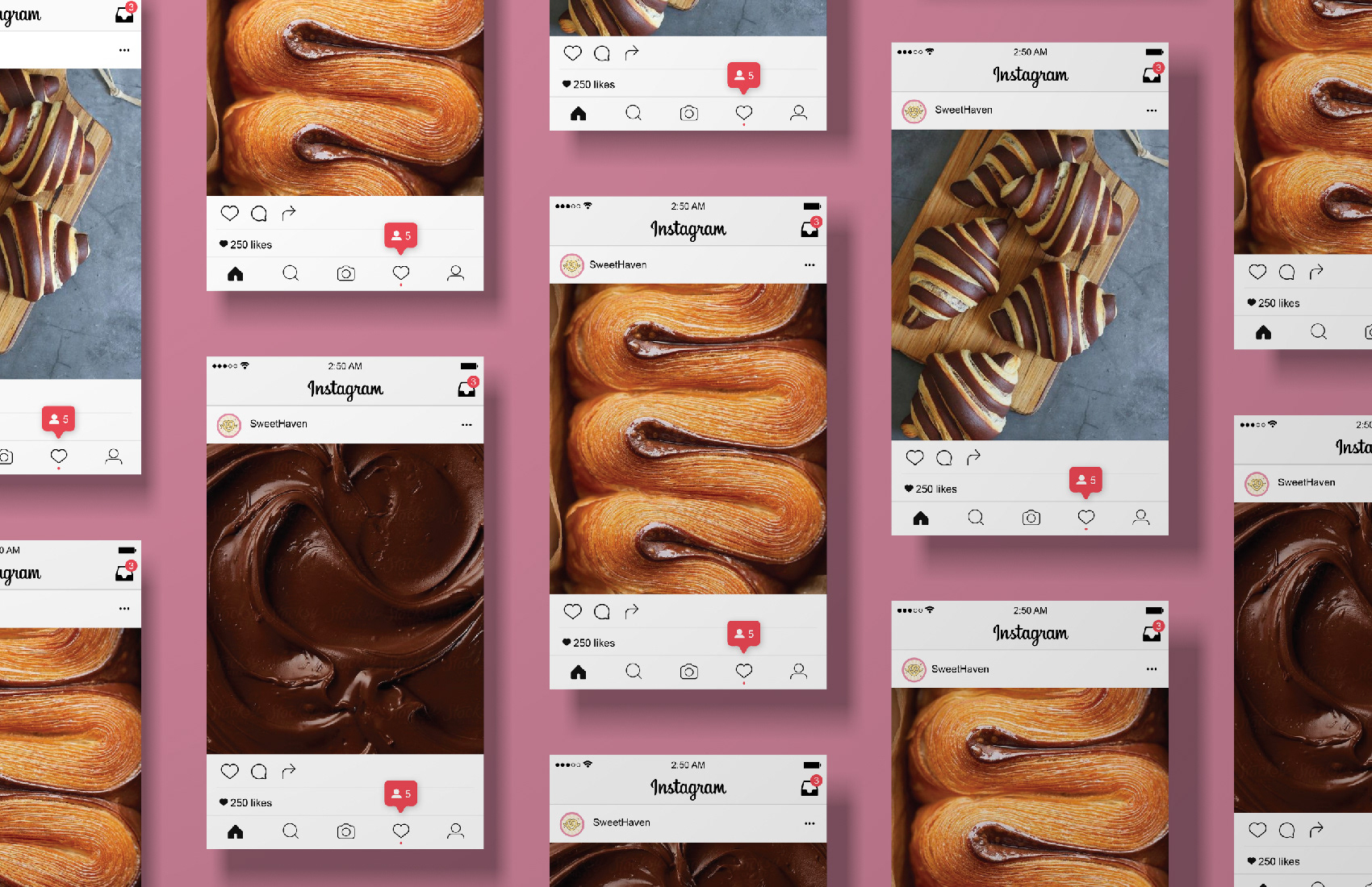
Thank you for reading! Below are some more mockups I created to visualize the brand more effectively.