Project Overview
Nishé founders came to me wanting a standout brand identity that truly captured their vision for premium modest activewear and athleisure. Their product line gives women and girls full coverage for sports, fitness, or daily life, all while honoring their values and keeping things super comfortable.
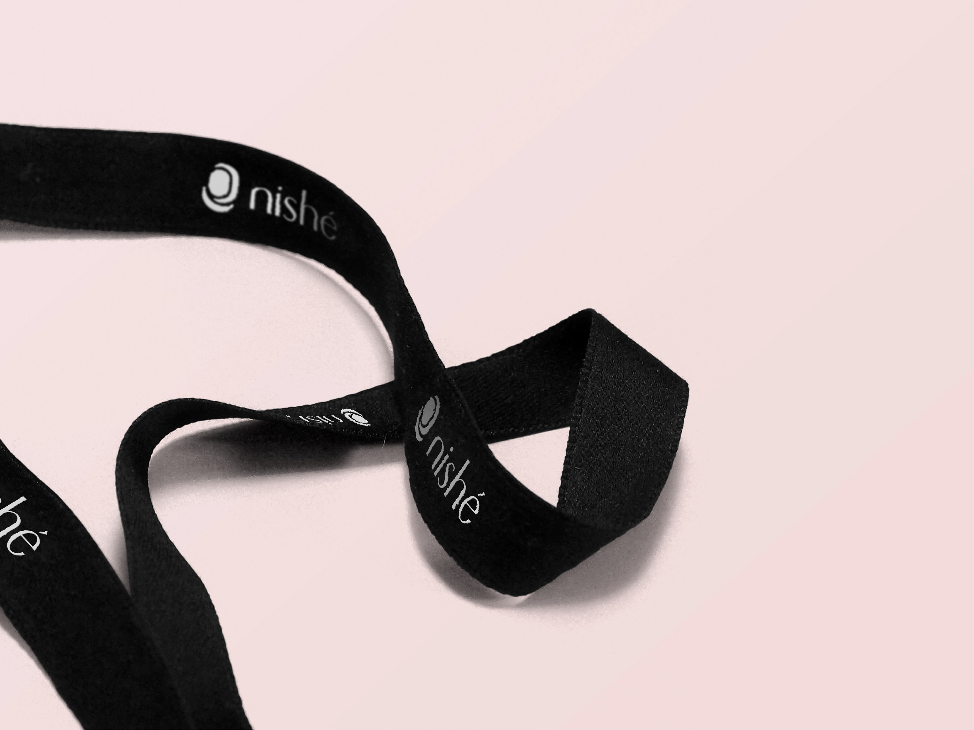
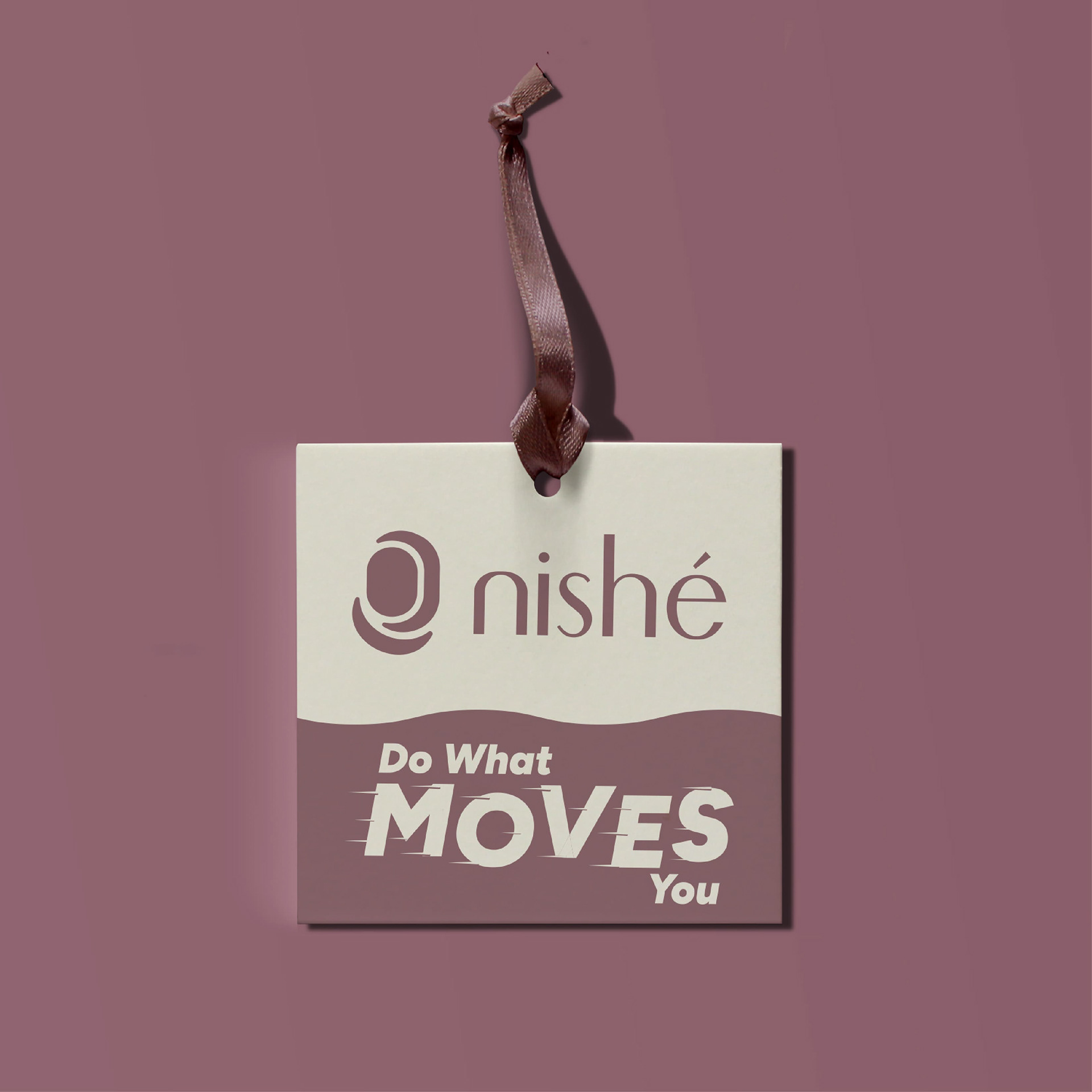
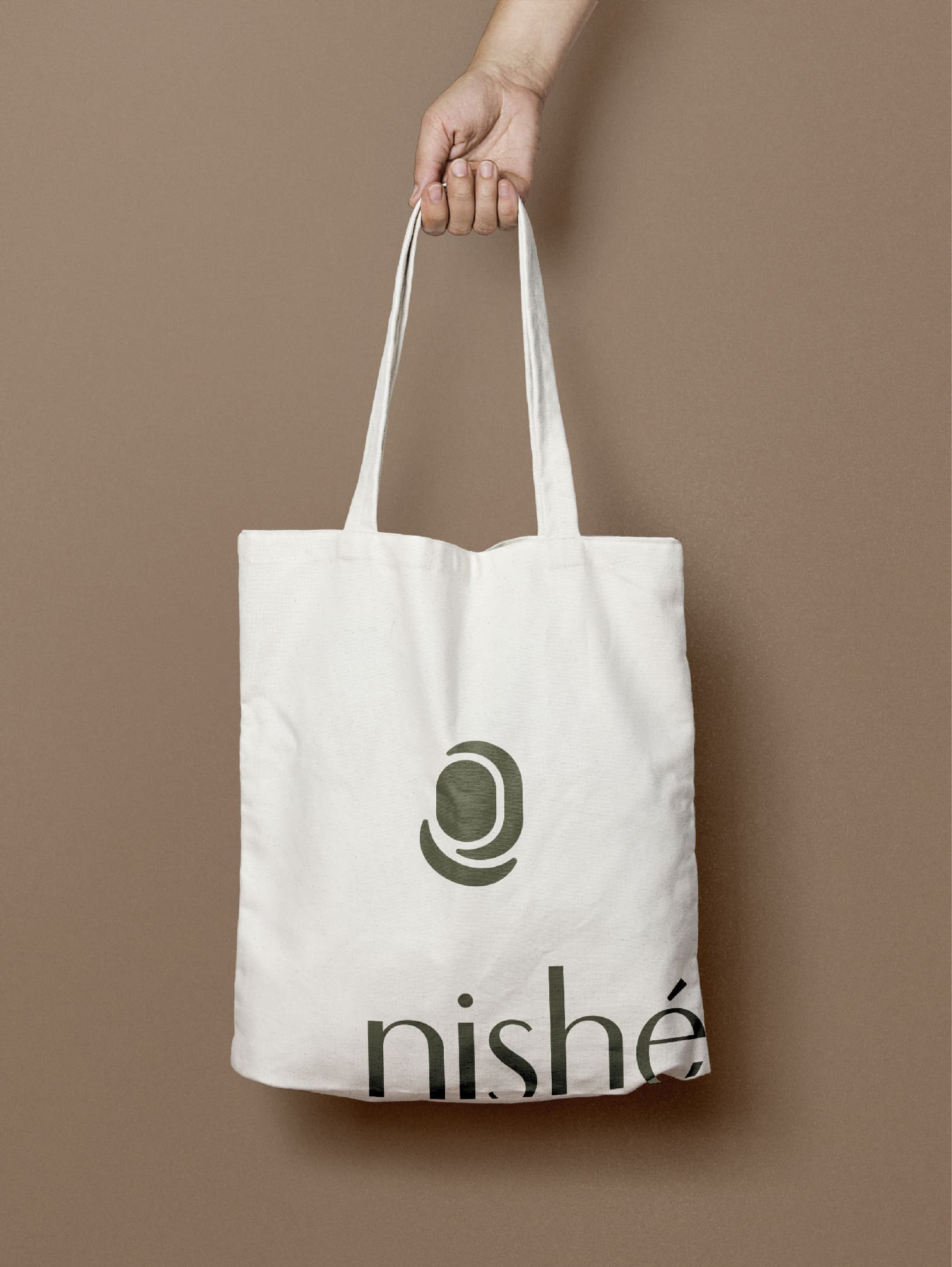
○ My role: To handle everything as the lead designer which included logo variations, full visual identity including color palette, typography, patterns, and photography direction, plus touchpoints like bookmarks, heat print garment labels, apparel hang tags, and mailer bags.
○ Goals: To blend elegance, modesty, and a bit of fun. To make diverse women feel stylish and strong.
Process Steps
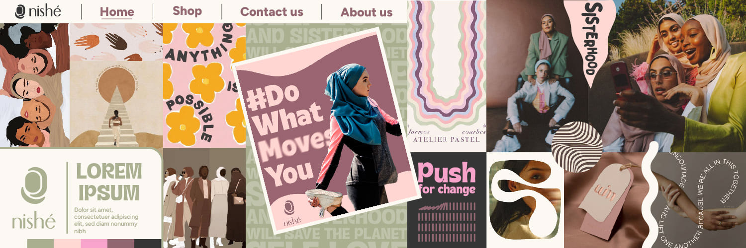
○ Research: I kicked things off with a client questionnaire and their visual references to get on the same page about the vibe right away. Through chats and research, I dug into the brand's focus on inclusivity for women prioritizing comfort and confidence. Then I put together three distinct moodboards, each with its own personality and tone
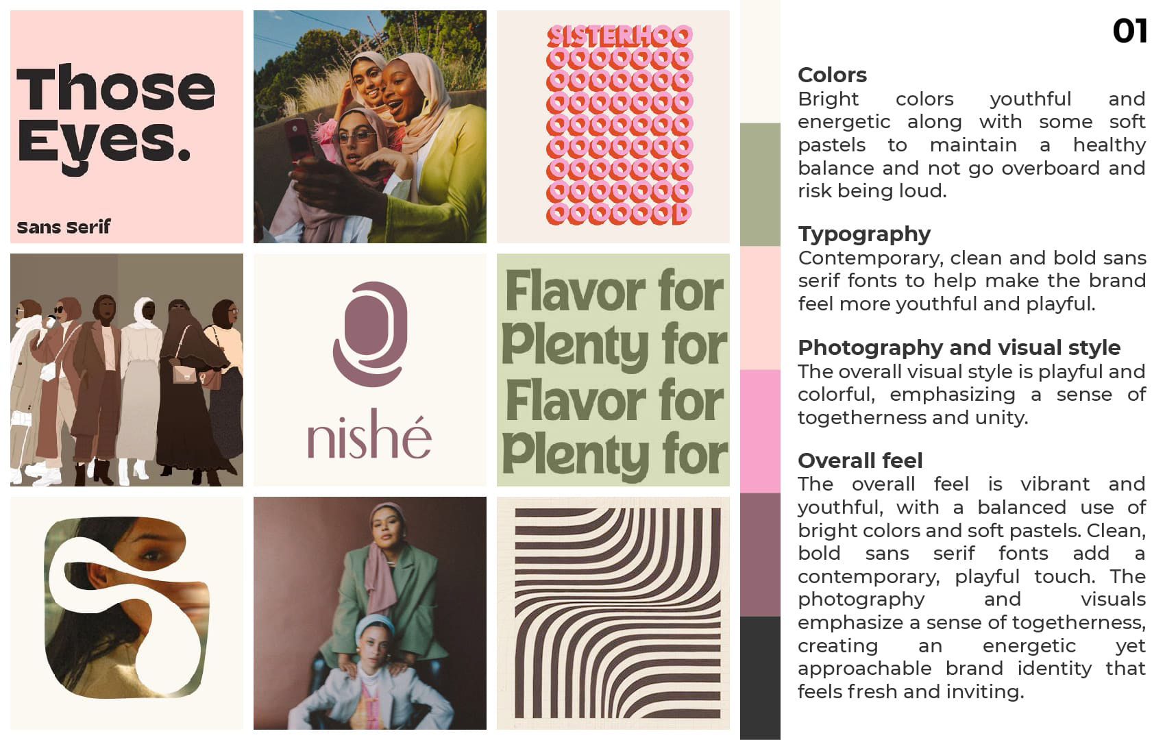
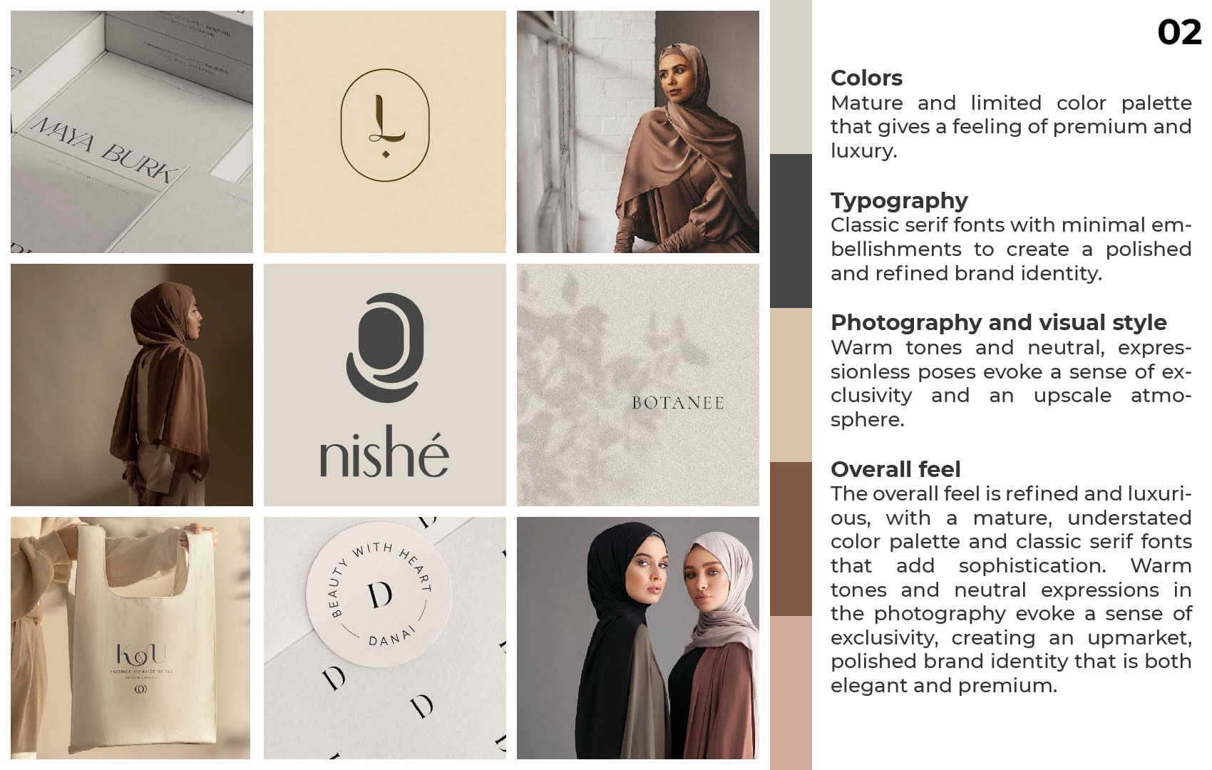
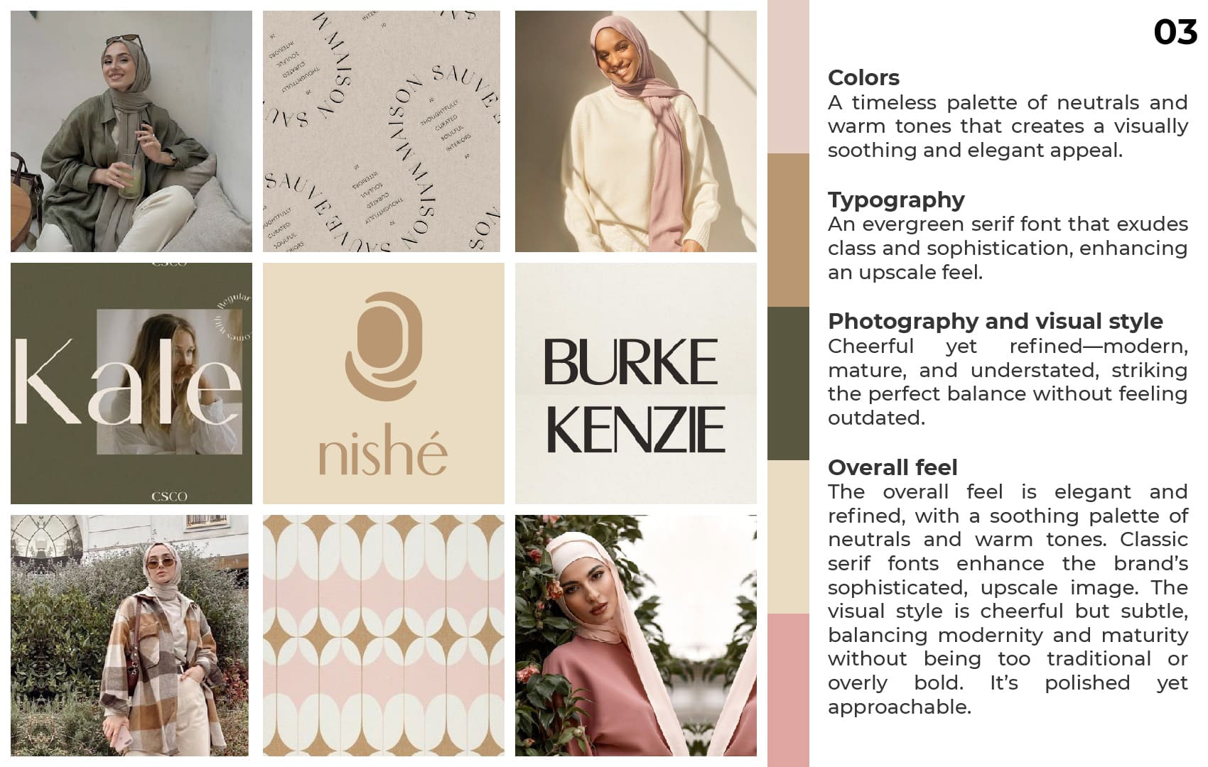
After reviewing the moodboards, we decided a blend of options 1 and 2 best balanced the brand's fun and elegant tones. I then created a stylescape to preview the cohesive look.
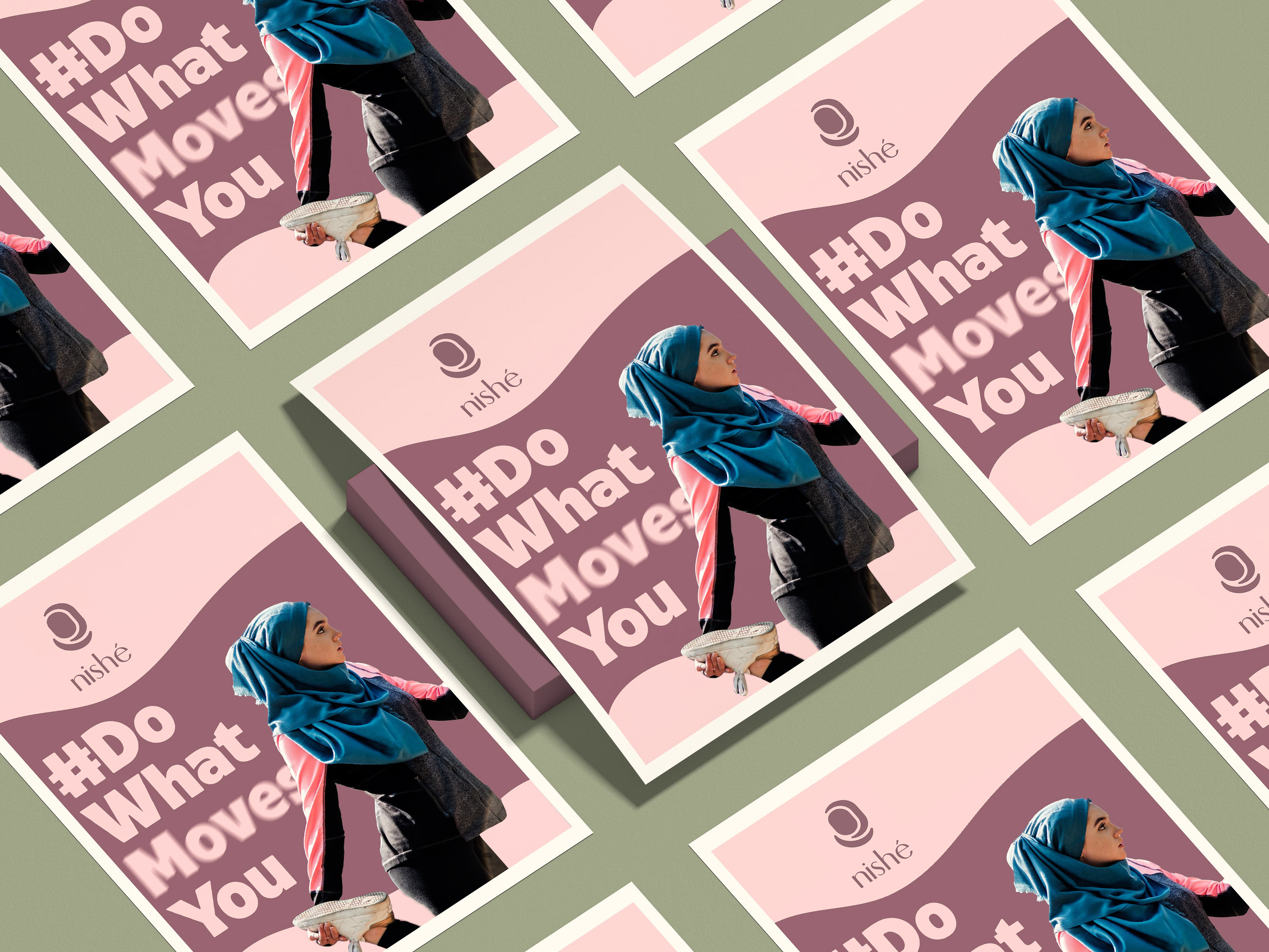
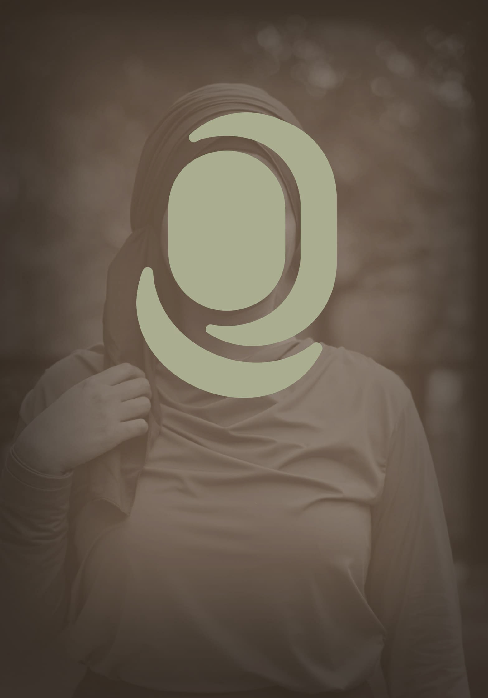
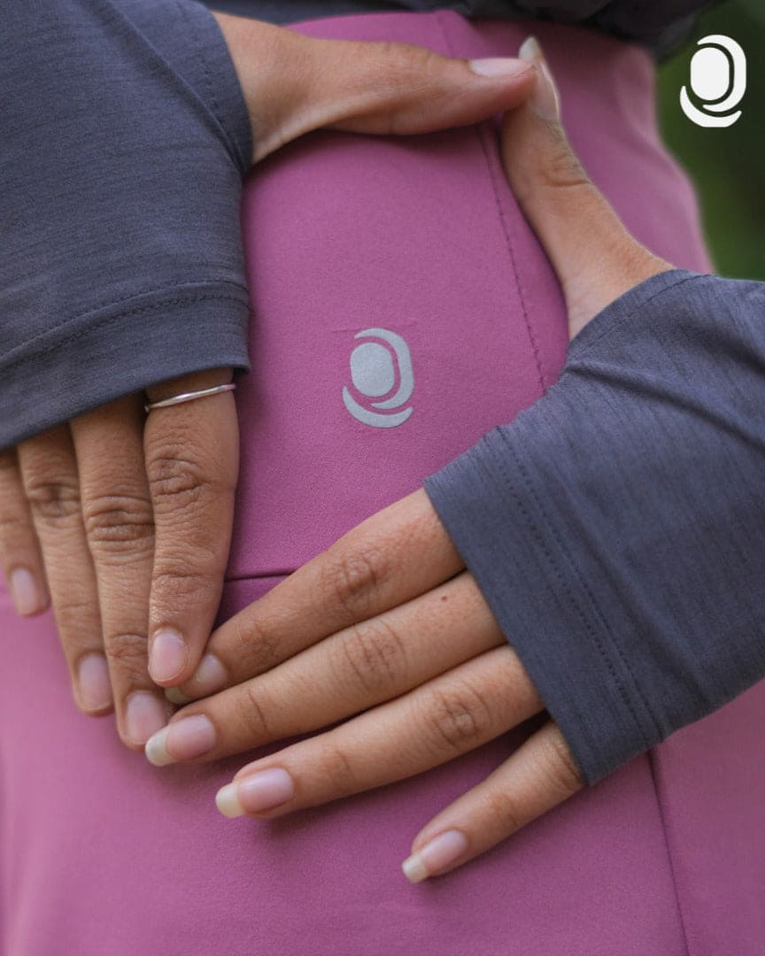
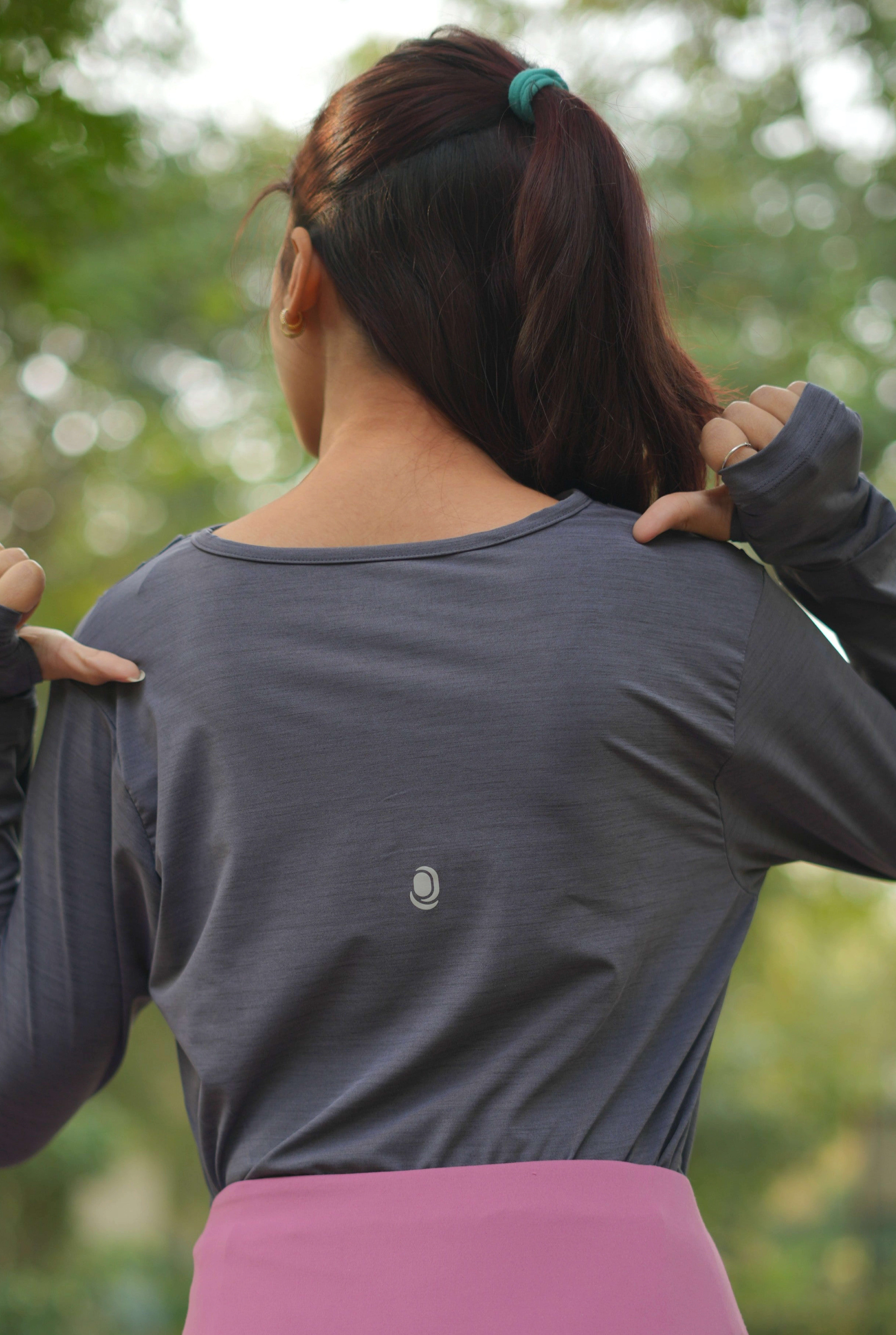
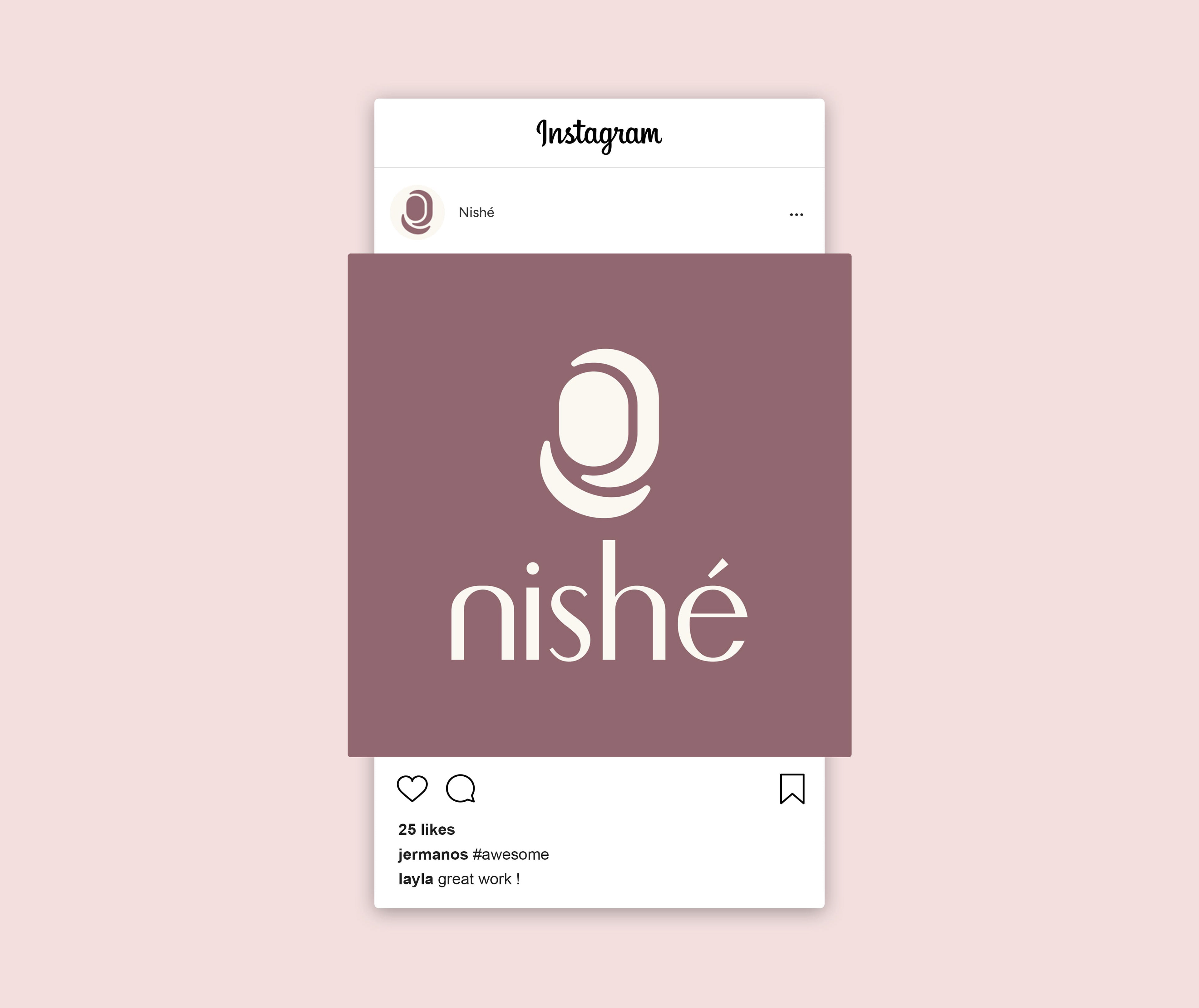
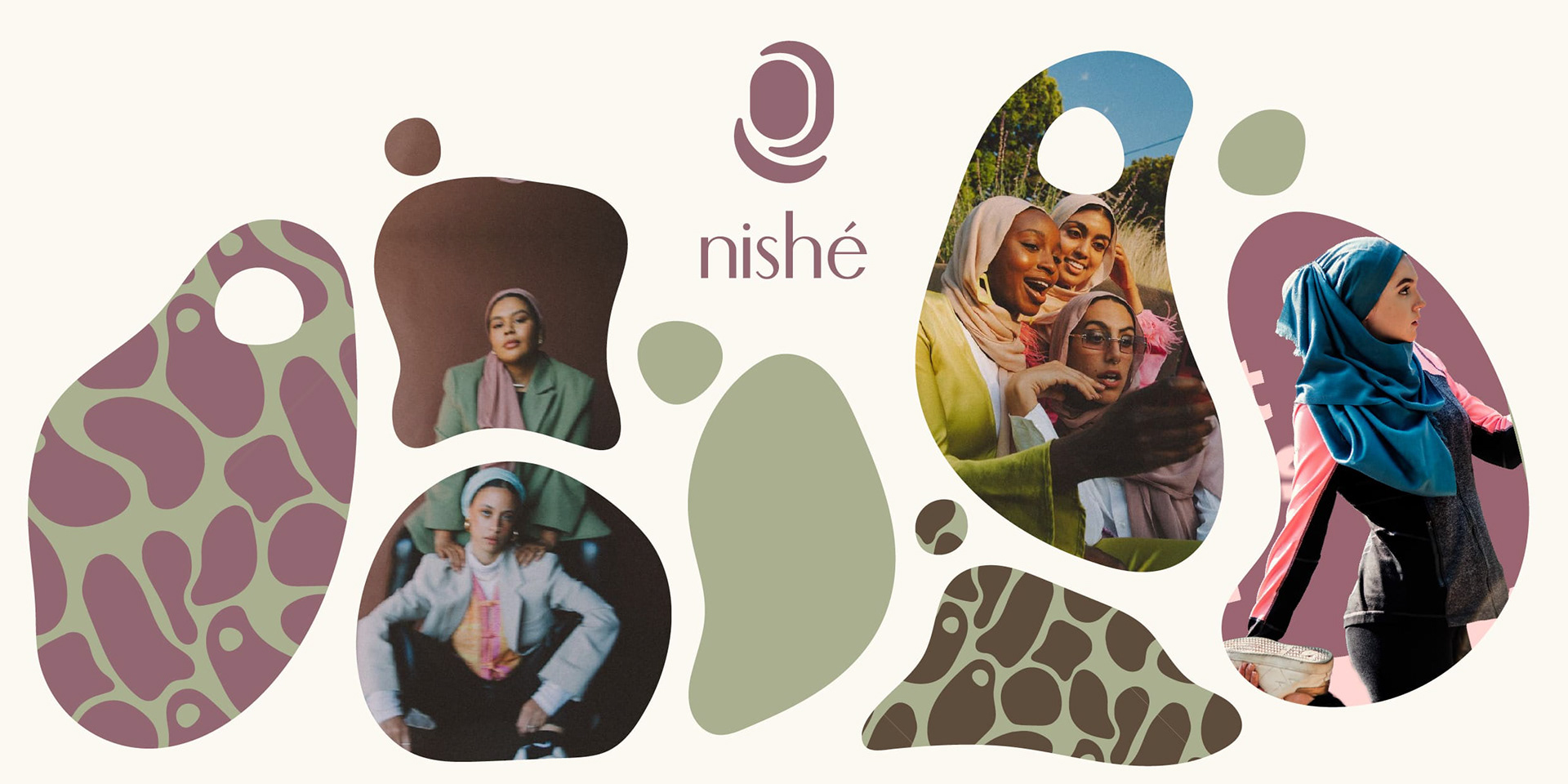
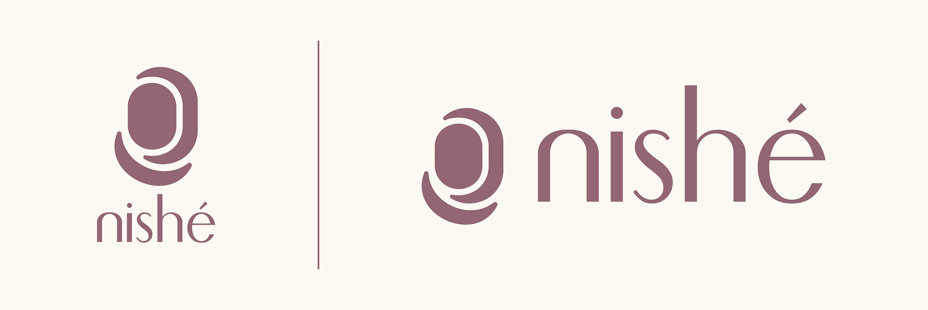
○ Logo Creation: Logo came first because the client needed it fast for manufacturer deadlines. I sketched ideas on paper to explore freely, landing on four concepts. One played with draped hijab fabric layers, but we scrapped it since it looked too much like a doorway and had scalability hiccups. The winner turned into this clean, minimalist sans serif mark with soft curves for feminine grace, subtly nodding to a faceless woman in hijab for that inclusive touch.
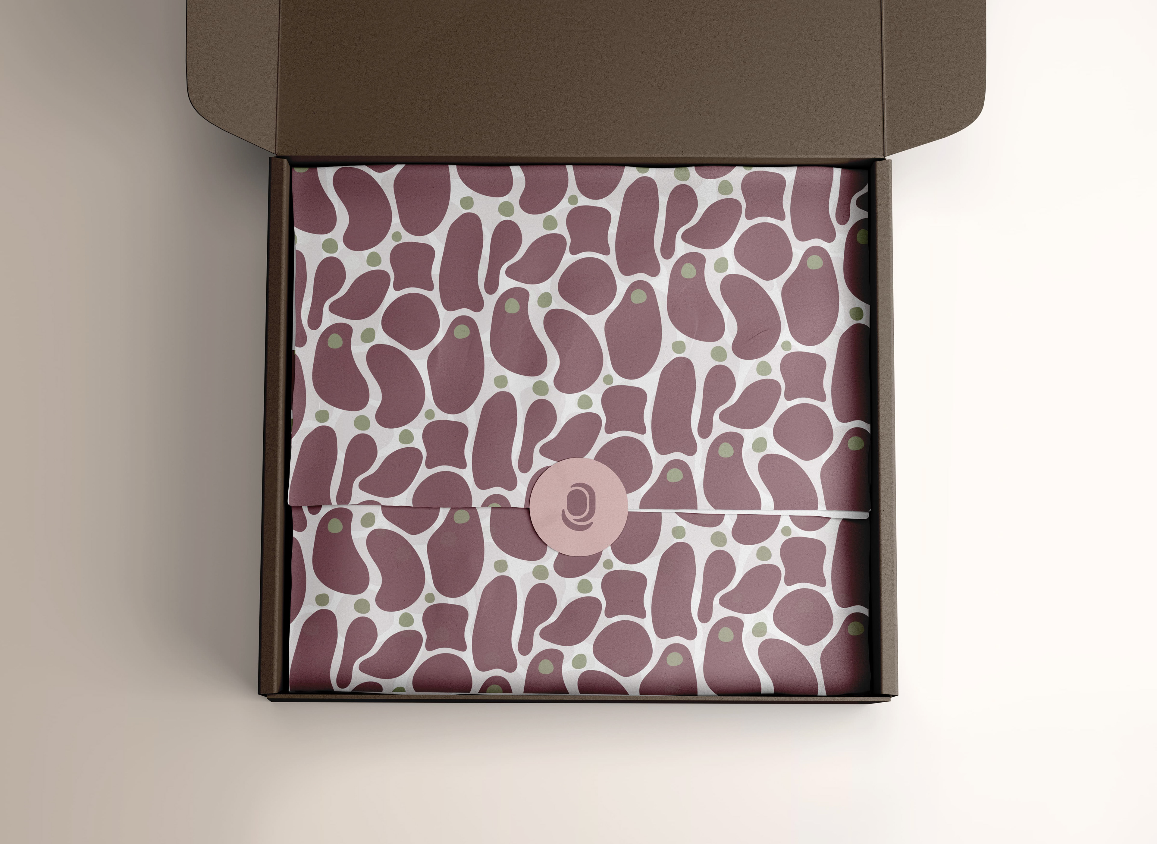
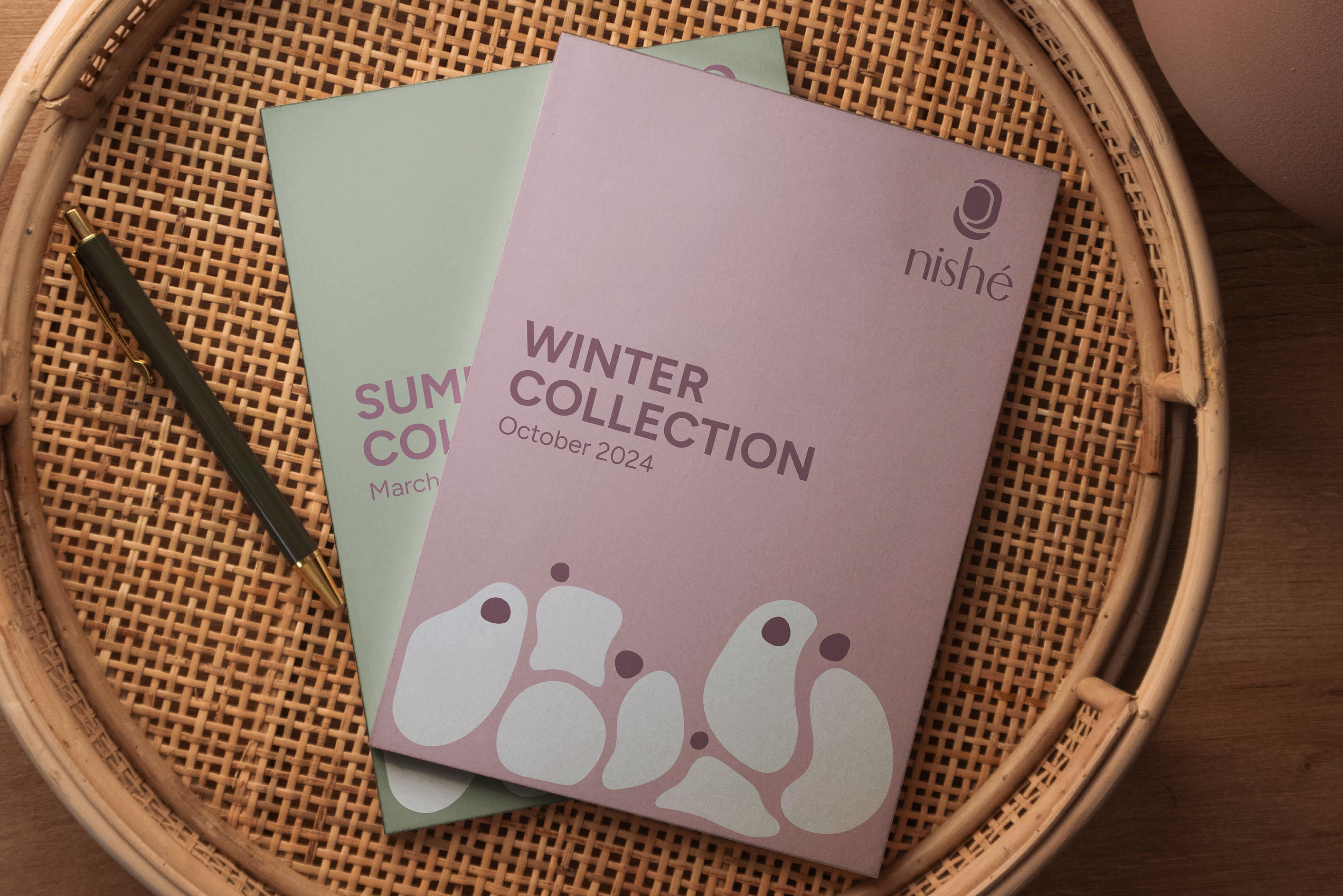
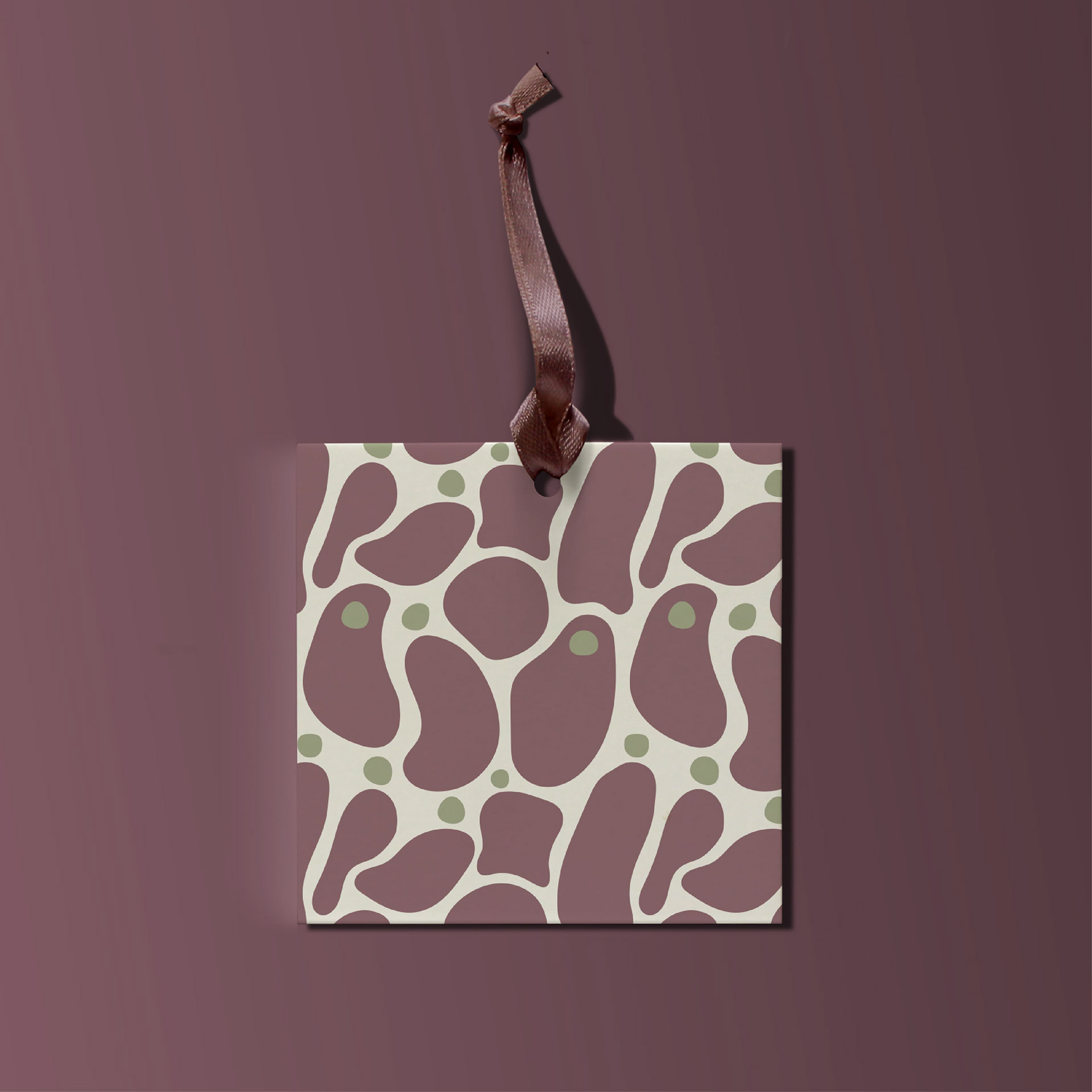
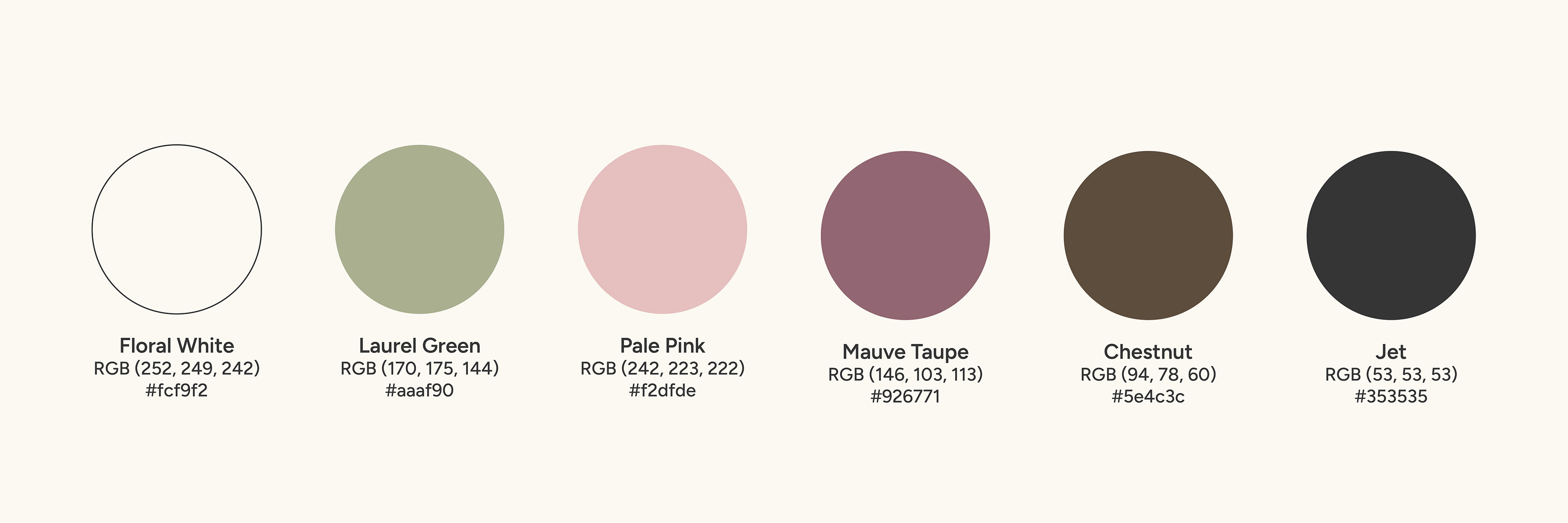
○ Colour Palette: I created a dynamic color palette. Any warm, soft hue can mix in, but these six core ones keep it recognizable: Floral White for a timeless base, Laurel Green for fresh nature vibes, Pale Pink for warmth, Mauve Taupe for subtle richness, Chestnut Brown for earthy depth, and Jet for sleek contrast. They balance modesty, sophistication, and playfulness beautifully.
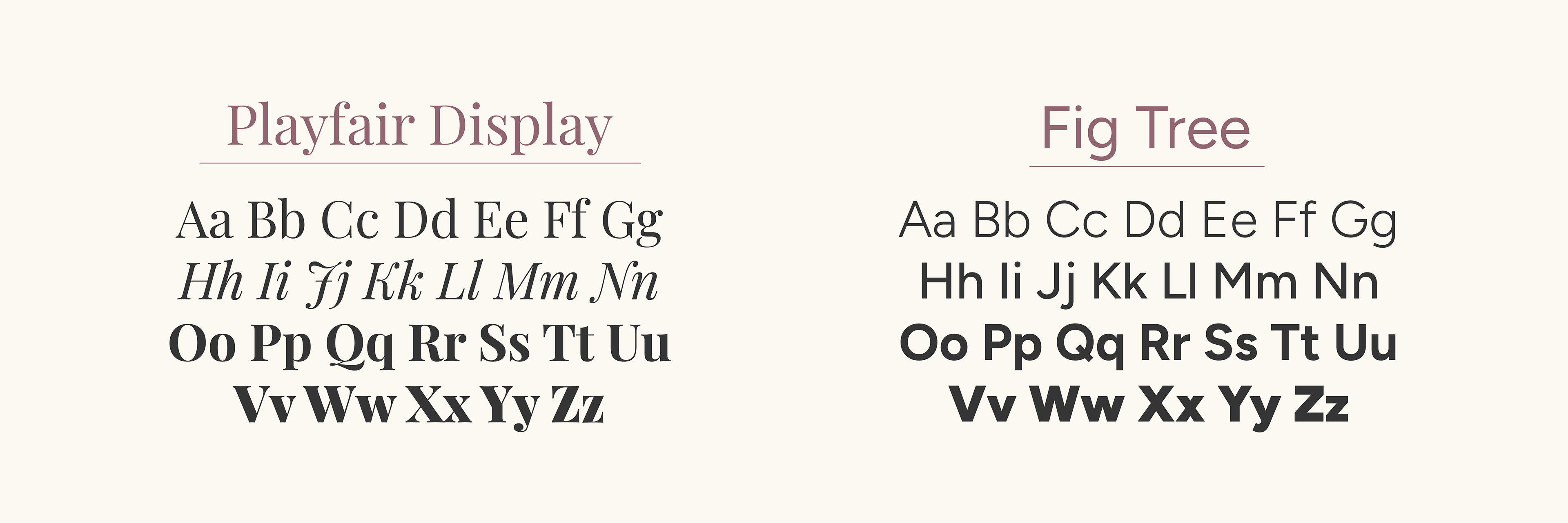
○ Typography: For typography, Fig Tree brings modern sans serif freshness paired with Playfair Display's classic serif elegance.
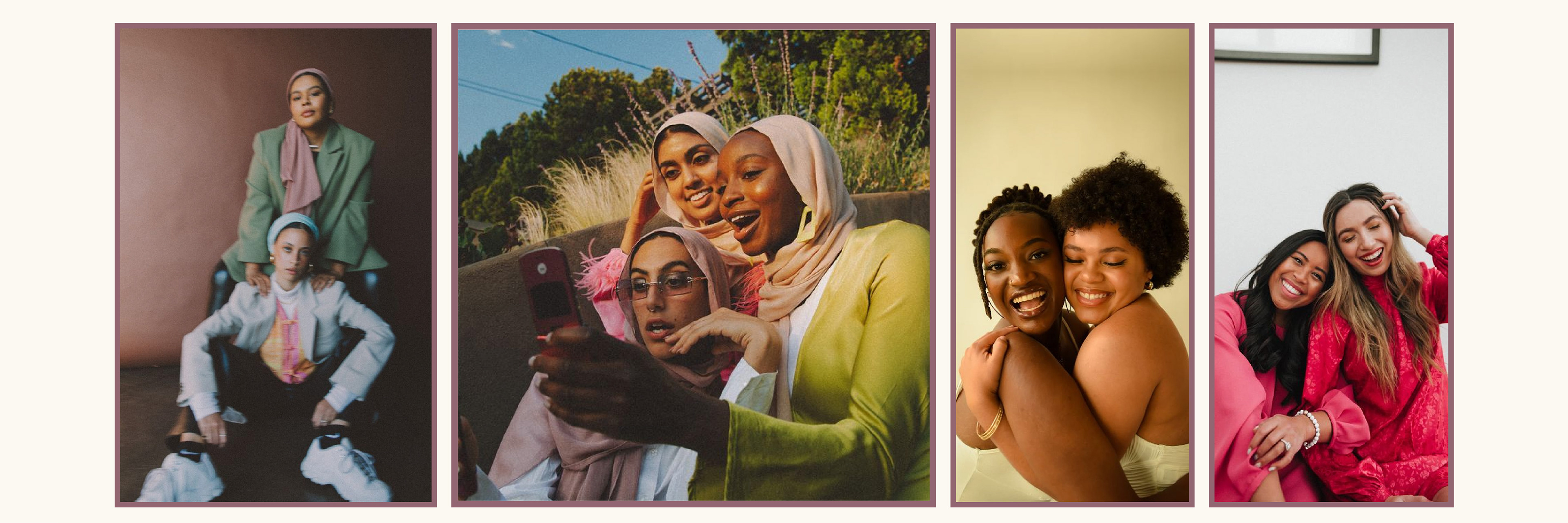
○ Photography Direction: Nishé photography direction captures diverse women radiating natural confidence and joy in carefree, empowering moments together. Images spotlight individuality, fun, and inclusivity, with models feeling stylish and comfortable in activewear. The vibrant, authentic aesthetic reflects the brand's mission to empower everyday lives
Brand Visuals