Project Overview
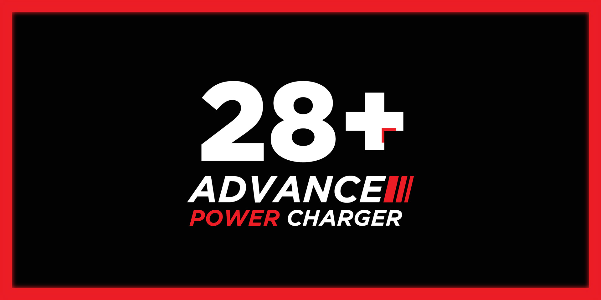
28+ Advance Power Charger is an Ayurvedic men’s energizer pill product created by Dr. Robin Sharma as he transitioned from prescribing other brands’ medicines to launching his own brand. The packaging needed to address a sensitive category (men dealing with fertility issues). The guiding idea was the proverb “बिना कहे बहुत कुछ कह जाना” (“saying a lot without saying anything”)
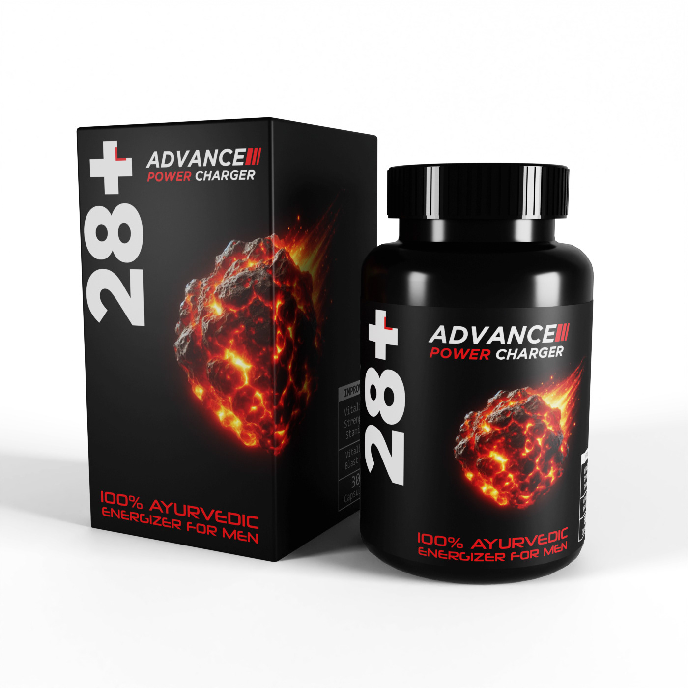
This project covered production-ready packaging design (including printing dielines and the outer box & bottle label design) along with complimentary product mockups / 3D-style renders for visualization and presentation use.
What is Ayurved? (optional read)
Ayurveda, is an ancient Indian system of medicine, rooted in the principles of balance and harmony between the body, mind, and spirit. It emphasizes natural remedies, lifestyle changes, and holistic practices to treat and prevent illnesses.
Many Indians opt for Ayurveda over allopathy due to its reliance on natural herbs, minimal side effects, and a focus on addressing the root cause rather than just the symptoms. Additionally, Ayurveda's deep cultural and traditional significance instills trust in its methods, especially for chronic conditions where long-term allopathic treatments might pose challenges.
Design Process
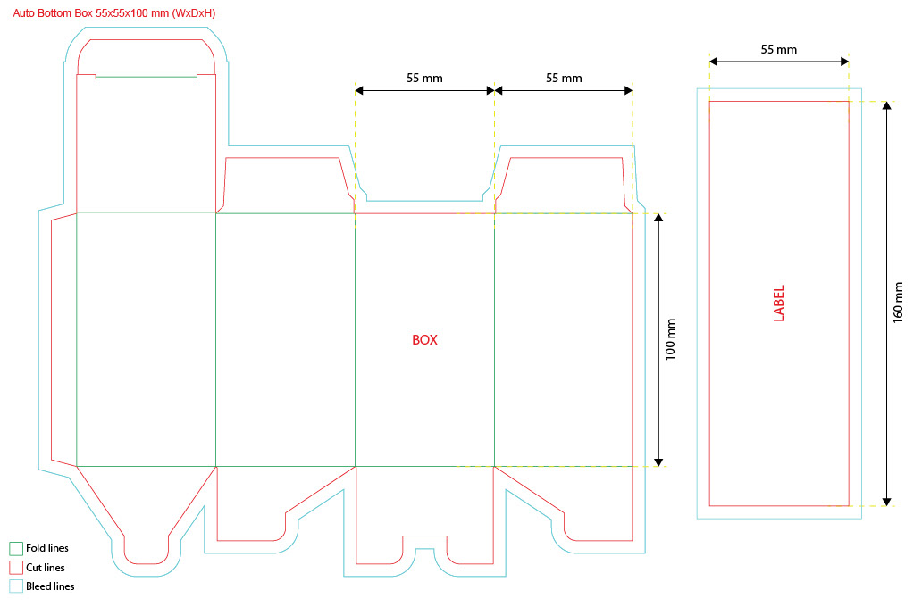
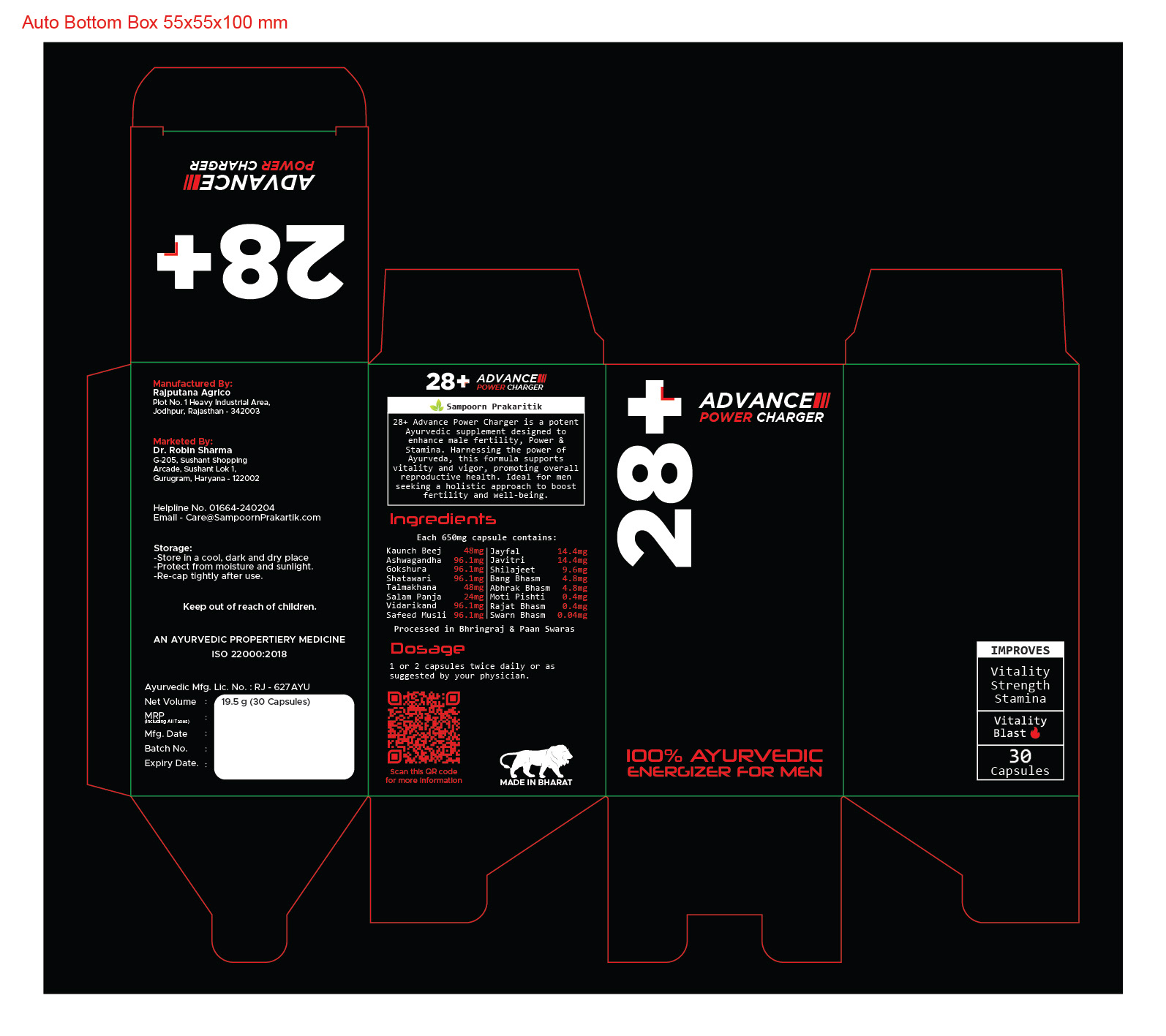
Work started with the dielines, using them as the base canvas to figure out structure, hierarchy, spacing, and what would actually work once the pack is printed and assembled.
○ Creating the Dielines: As always, I began this packaging design project by creating the dieline, as it provides a structured canvas to work on. The packaging was a straightforward rectangular box with an auto-bottom design, making it both functional and easy to assemble.
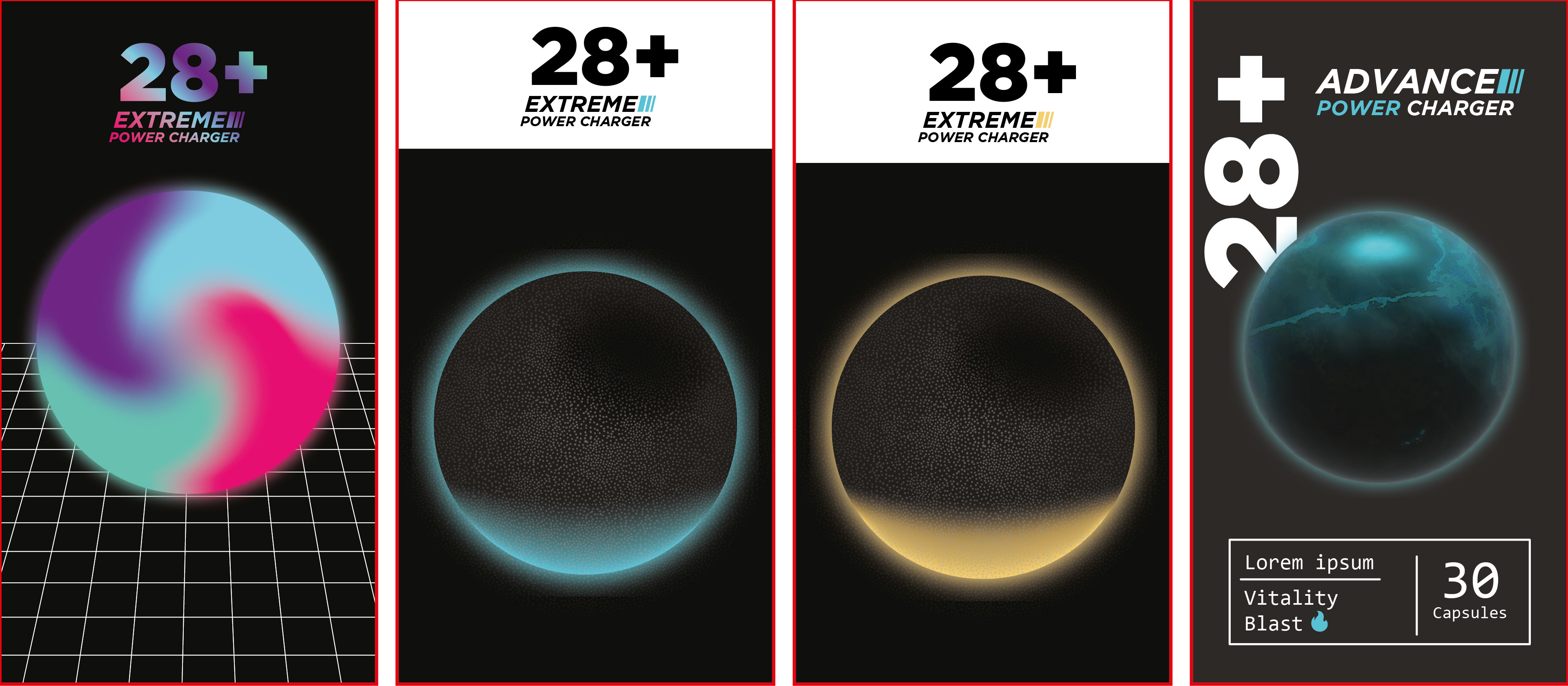
○ Creating the Design: The client wanted either a black or white base. Black was selected to keep the pack bold but minimal, and to keep white open for a future product in the range.
The palette was kept intentionally minimal so the main hook visual could do most of the work. The layout followed a 70/30 balance, with most of it staying quiet and clean while one area delivers the main impact.
I explored a range of early front-face layouts to test composition and hierarchy before committing to the final direction. At this stage, the central spheres were temporary placeholders meant to be swapped once the hook visual was finalized.
Those placeholders were 3D orbs I’d built in Illustrator during earlier experimentation, and they helped me quickly prototype an “energy” idea that felt naturally aligned with the Men’s Energizer Pills concept while the final metaphor was still taking shape.
And the inspiration strikes...
It struck me like a comet falling from the sky 😉
But before I could work on the hook image, I wanted to complete the rest of the design so I could figure out how much space I could make for it on the front.
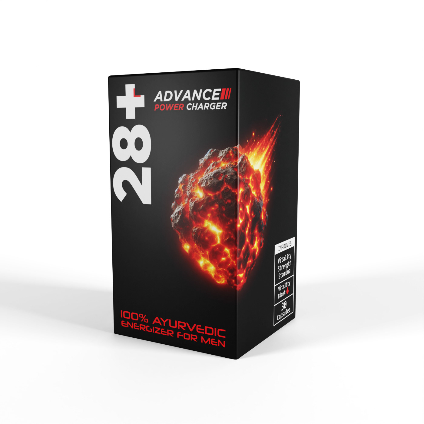
Red was chosen as the accent to convey energy and heat, and it was paired with space inspired typography to strengthen the central concept.

Creating the hook image
For the hook image, I decided to use a burning comet falling from the sky, as it was highly fitting for the product’s purpose.
In the Indian context, a comet is referred to as "Dhoomketu" in Hindi, a term also used metaphorically to describe a man brimming with vitality and sexual energy, a man at his peak mental and physical form. This symbolism perfectly aligned with the essence of the product, making it an ideal choice for the hook image.
Now that I had the idea and a clear vision, the next step was to create the image I had in mind. To do this, I turned to an AI image generator. It took some time to figure out the exact prompt that would accurately convey the image I envisioned to the AI, but after a few rounds of refining the prompts, I was able to generate an image that was close enough to what I had in mind. I then imported the image into Photoshop, where I made the necessary adjustments and edits to finalize it for use on the packaging.
This project was both challenging and incredibly rewarding. Bringing together the concept, color scheme, and unique hook image required careful thought and experimentation. Despite the challenges, the process was so much fun, and I really enjoyed the creative journey. It was one of those rare projects where everything came together in a way that was both satisfying and exciting, making it a truly one-of-a-kind experience.
To top it off, the client ended up loving the design and even sent me the product as a gift as a gesture of appreciation, making this a truly rewarding experience.