Project Overview
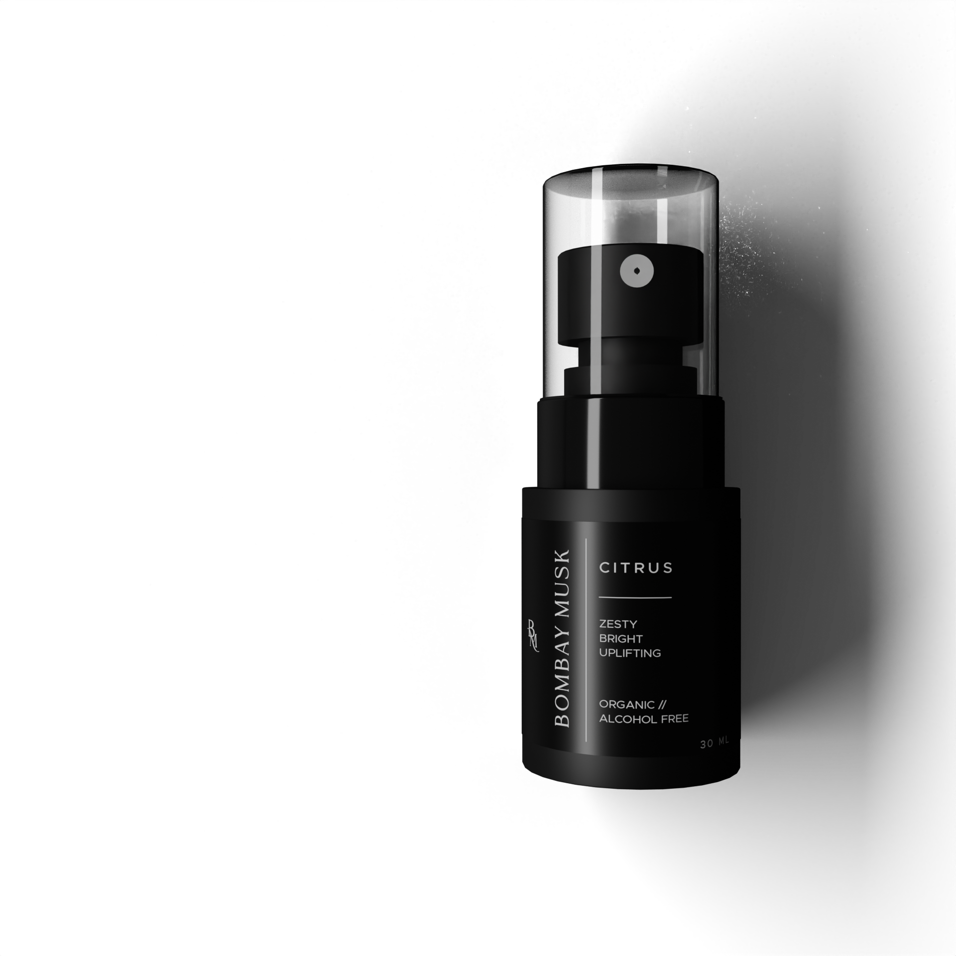
Bombay Musk is a luxury car‑accessories brand focused on premium car perfumes, made to turn everyday drives into a more elevated, “signature” experience.
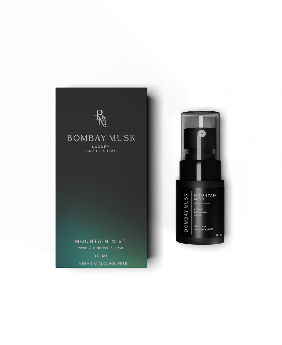
This project covered packaging design plus photorealistic 3D renders for product visualization and marketing use.
This project covered packaging design plus photorealistic 3D renders for product visualization and marketing use.
Design Direction
There were no full brand guidelines to start from, so the direction was built from the provided logo, packaging dimensions, and visual references.
To lock the creative direction, the brand vision was focused on these three keywords: luxury, minimal, and subtle.
Design Process
○ Audit (what needed improvement)
The client had explored early design drafts, but they felt too literal and flat for a premium product, and the variant name placement reduced the “luxury” feel.
Small-type elements also risked becoming unreadable at real print size, which would weaken shelf impact.
Small-type elements also risked becoming unreadable at real print size, which would weaken shelf impact.
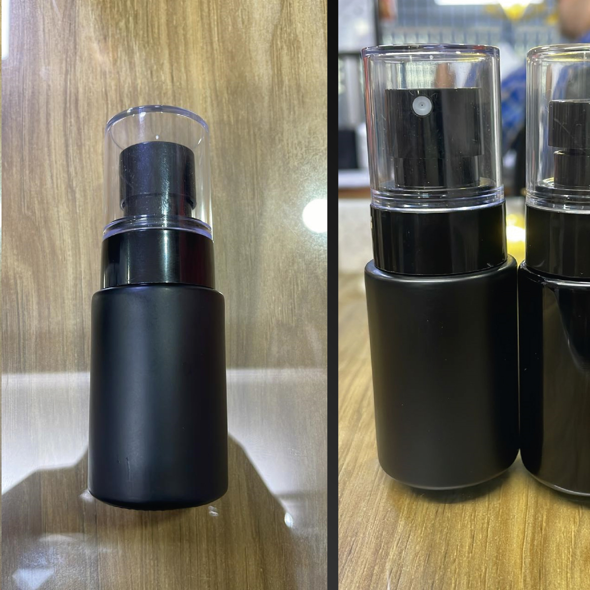
The designs shown below were provided by the client 👇
○ Design Structure
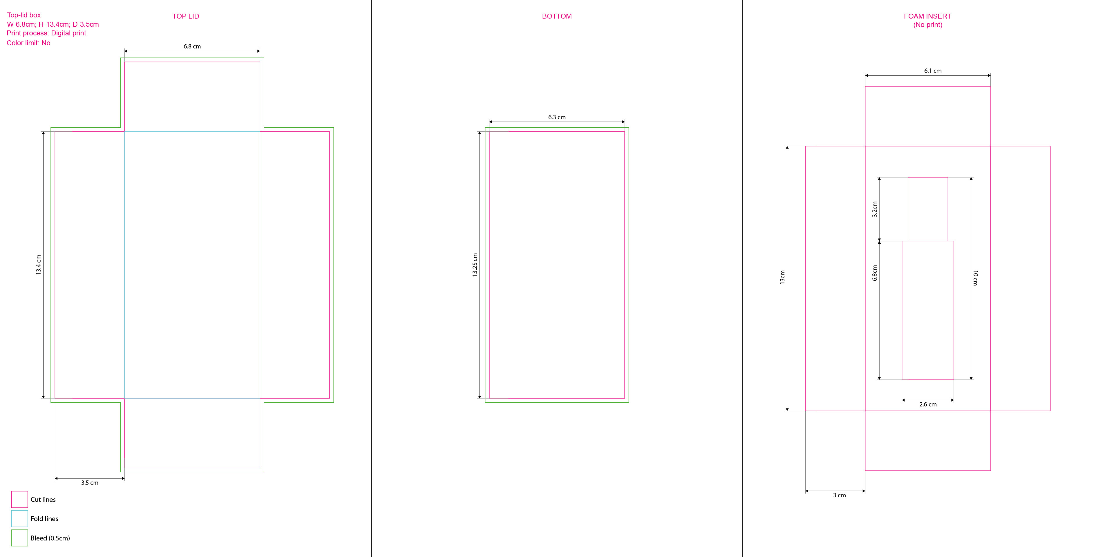
Work began by building dielines and confirming the printing approach before final artwork lock.
A physical sample was requested before finalizing dimensions to avoid expensive tooling changes and production delays later.
A physical sample was requested before finalizing dimensions to avoid expensive tooling changes and production delays later.
○ Working on the concepts
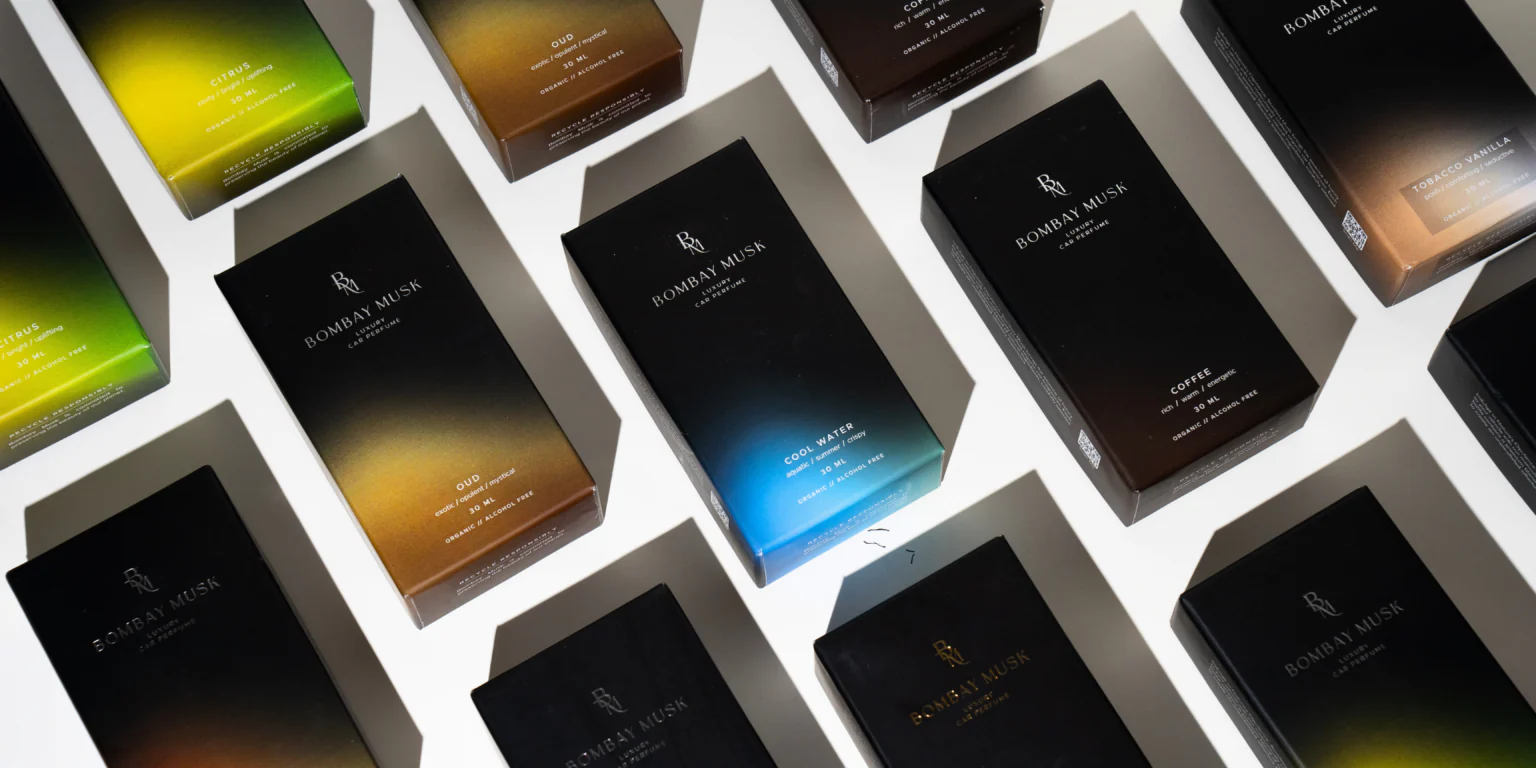
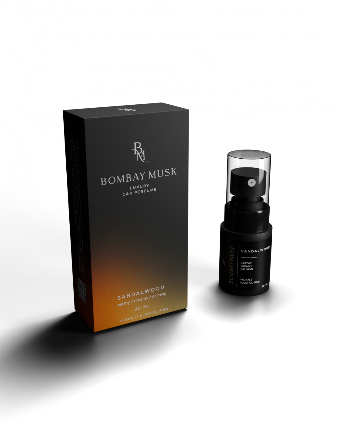
Three packaging directions were developed to test the balance between elegance and product storytelling.
Concepts 1 and 2 used a dark base with refined accent color transitions and subtle texture for depth, while Concept 3 refined the client’s original idea with a cleaner, more minimal look using understated pinstripes.
Concept 2 was selected because it could scale across variants by shifting color and provided more flexibility than relying on literal imagery for abstract fragrance names.
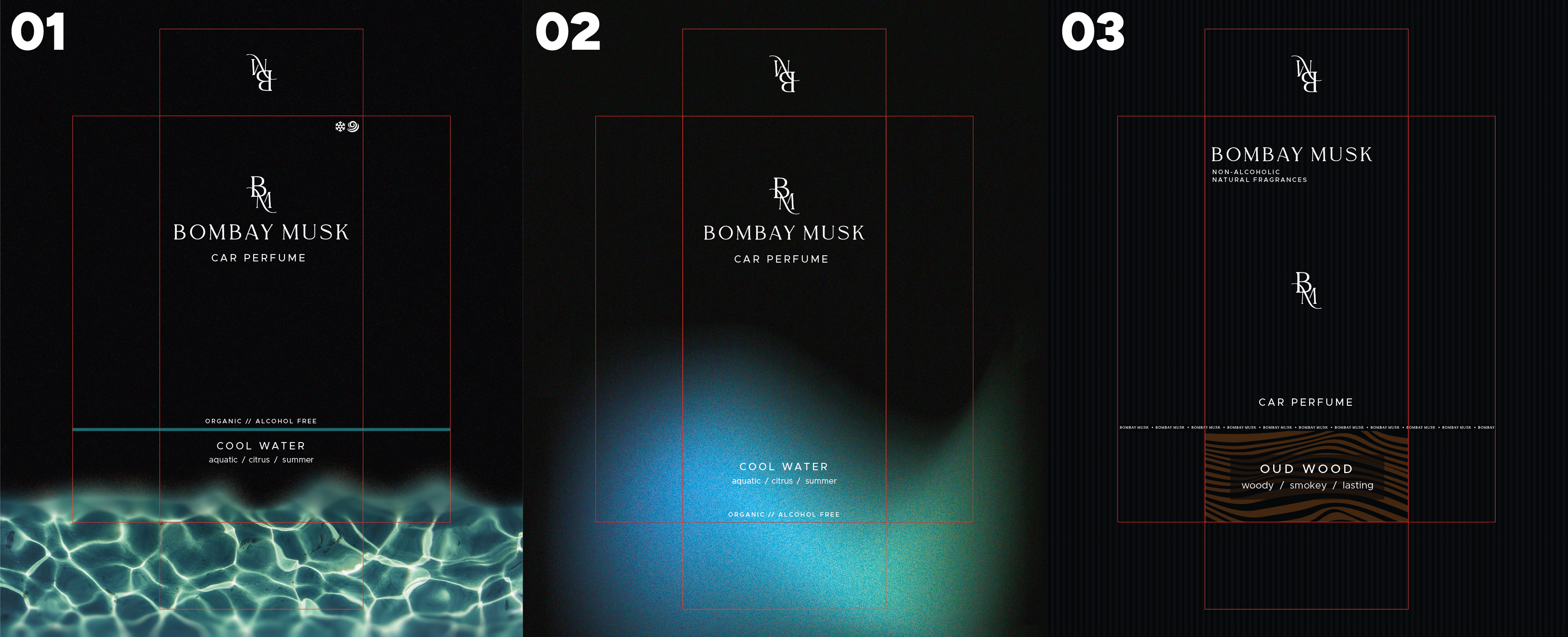
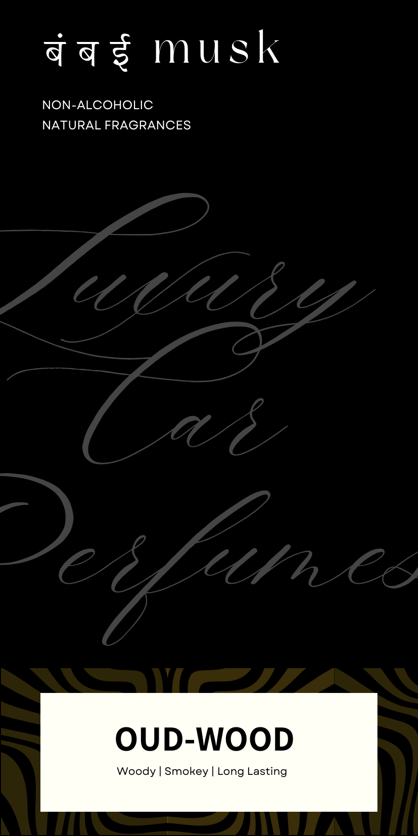
Concept 1
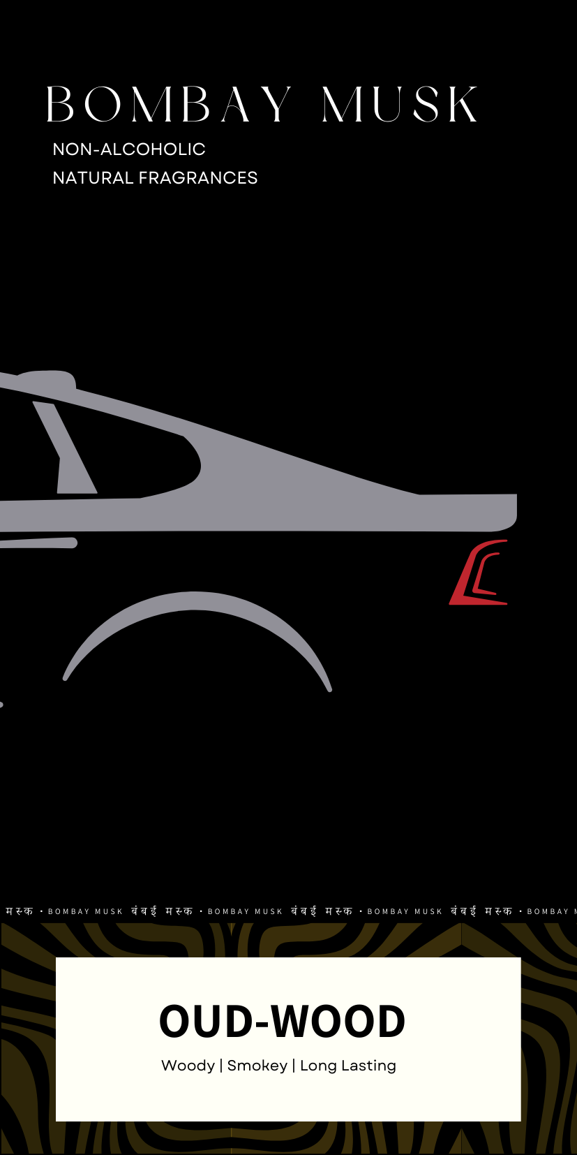
Concept 2
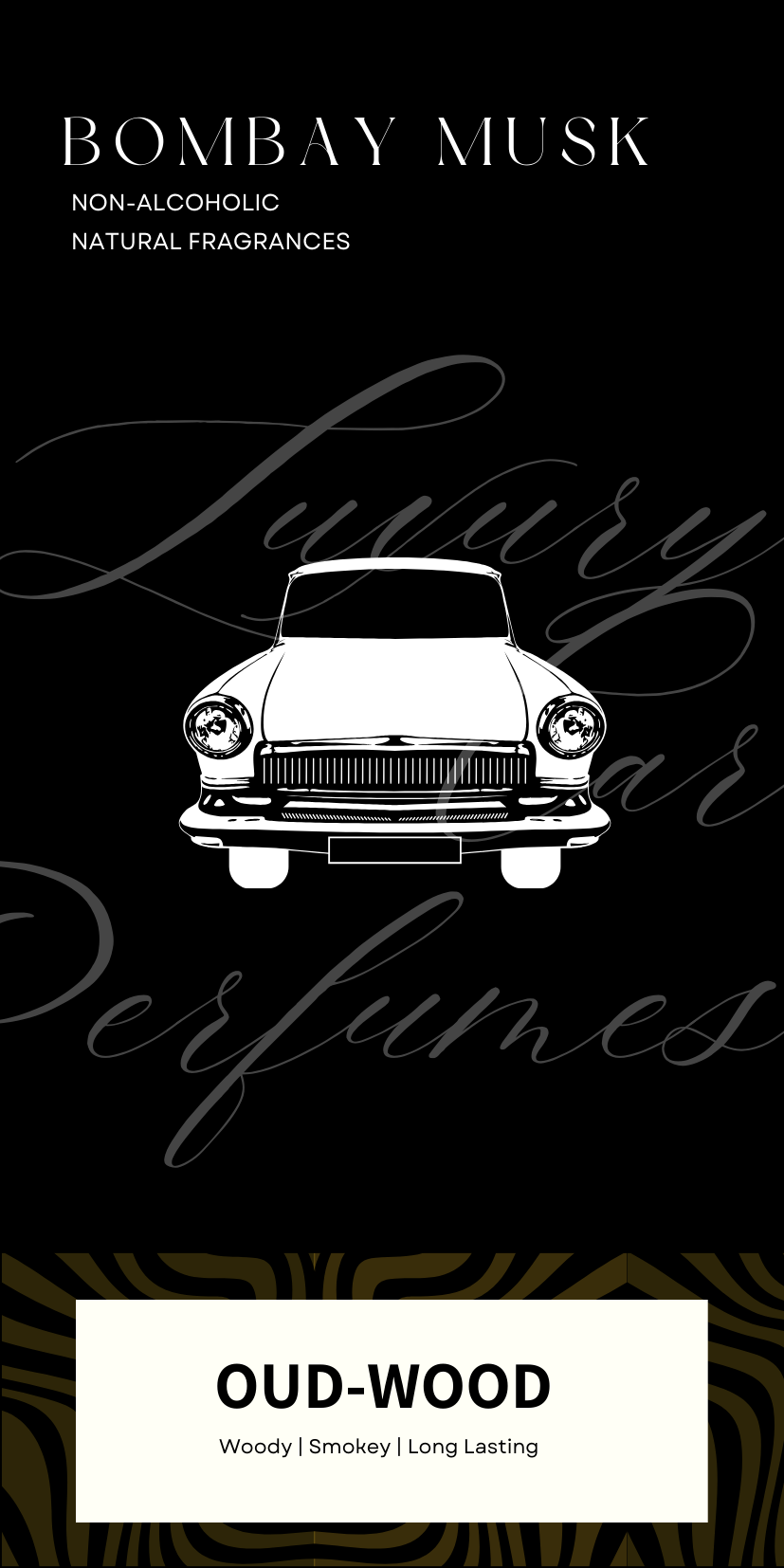
Concept 3
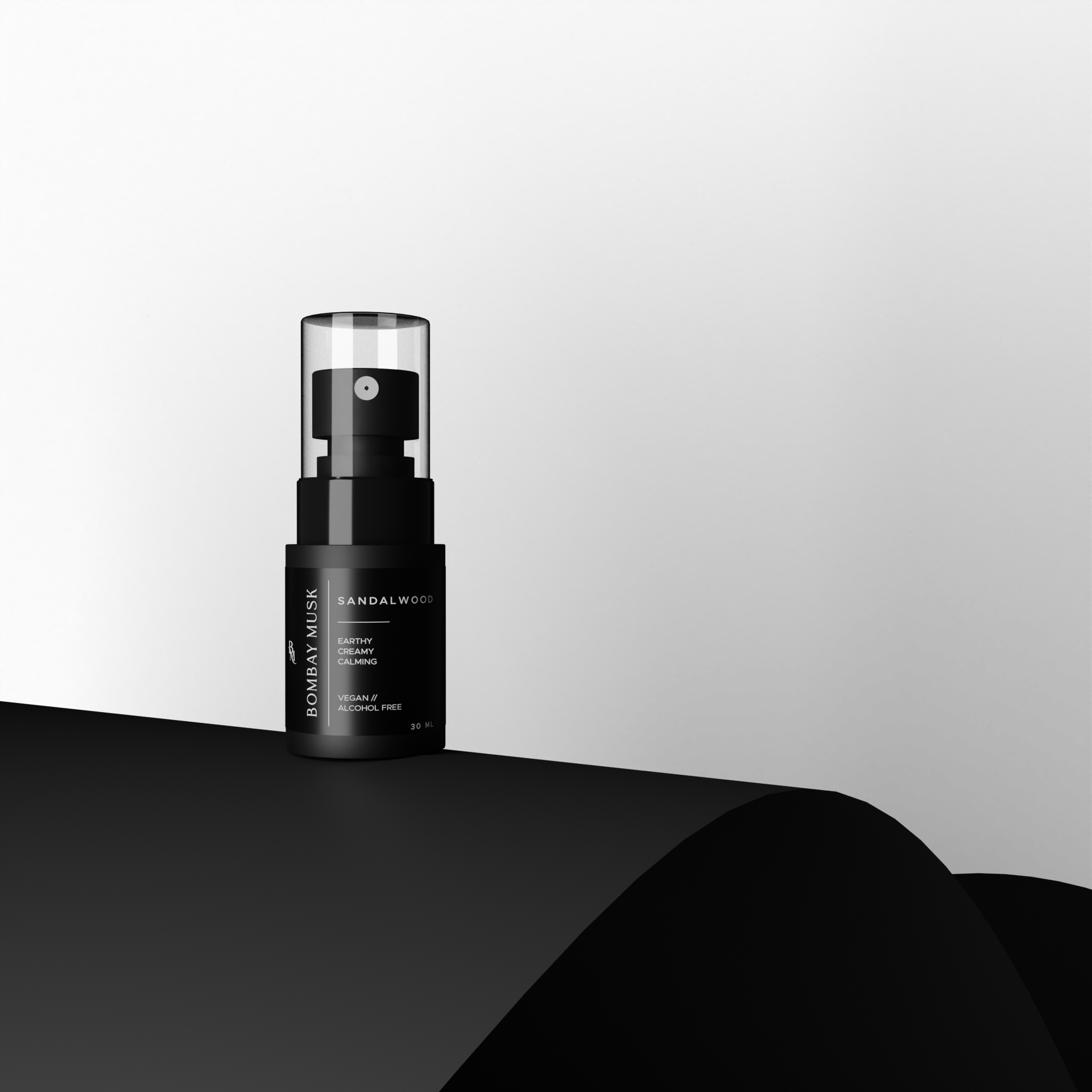
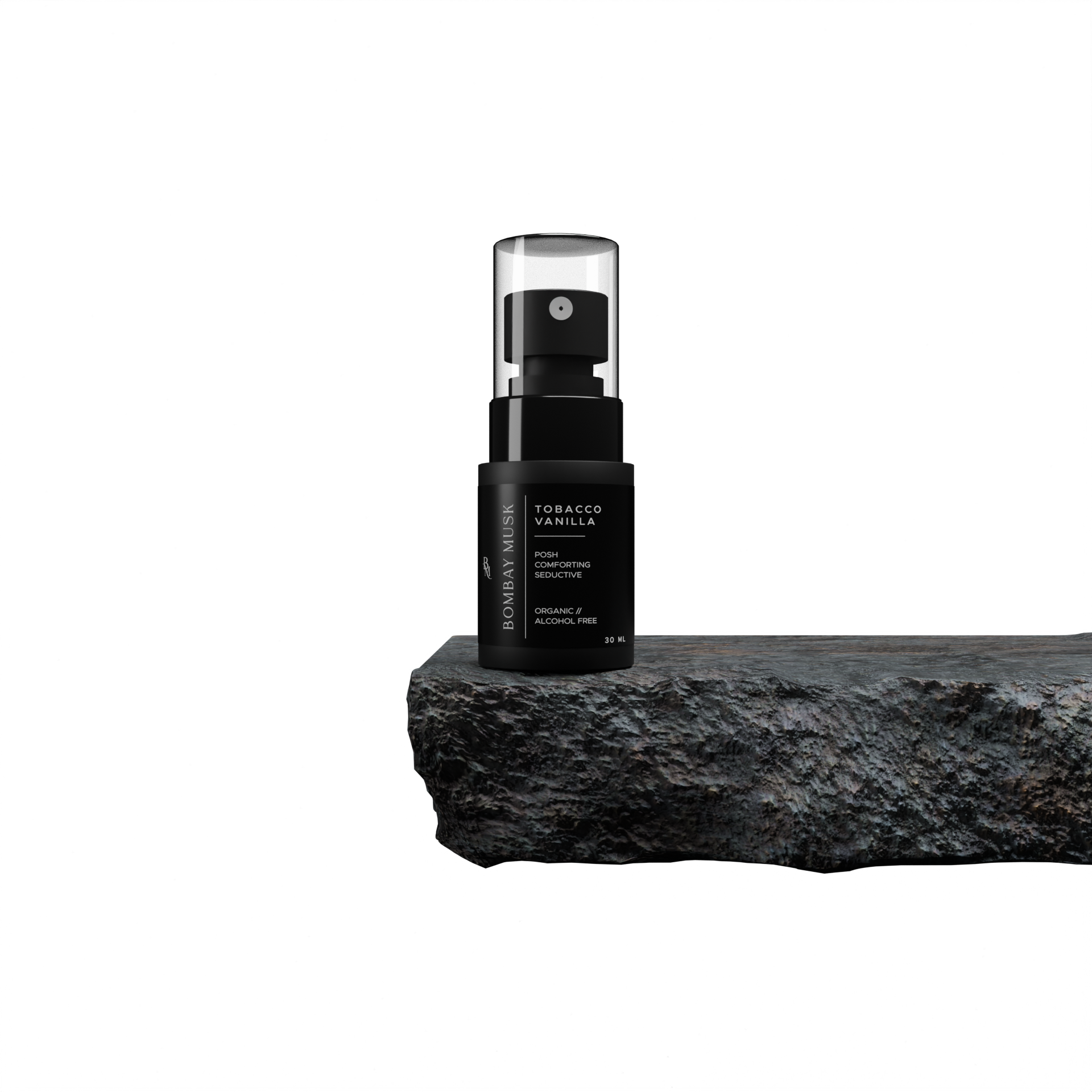
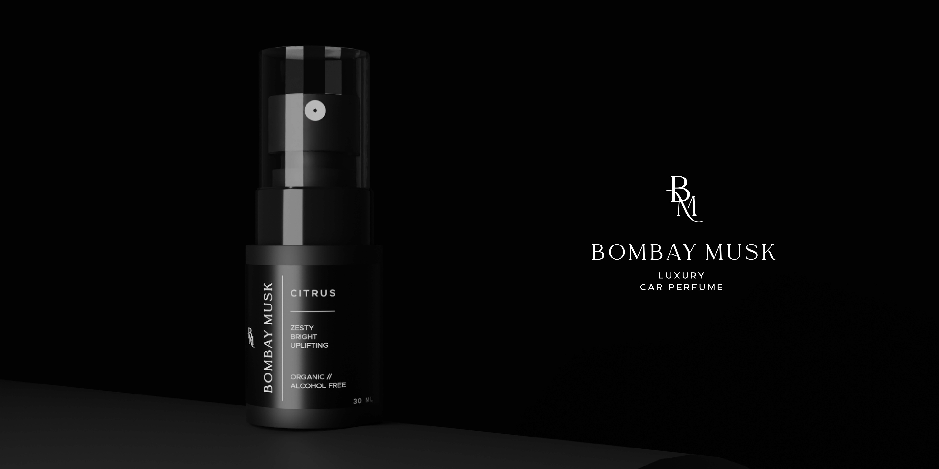
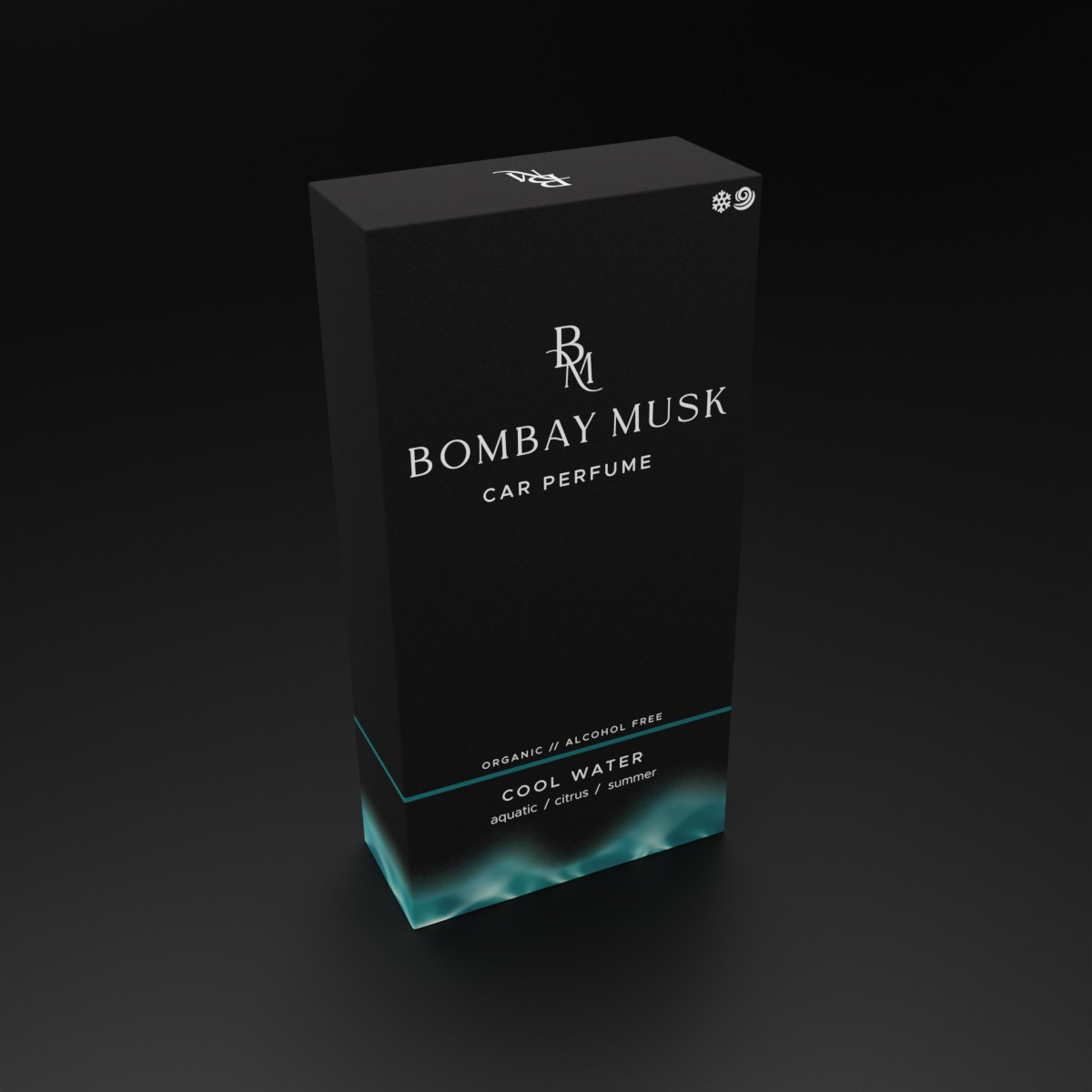
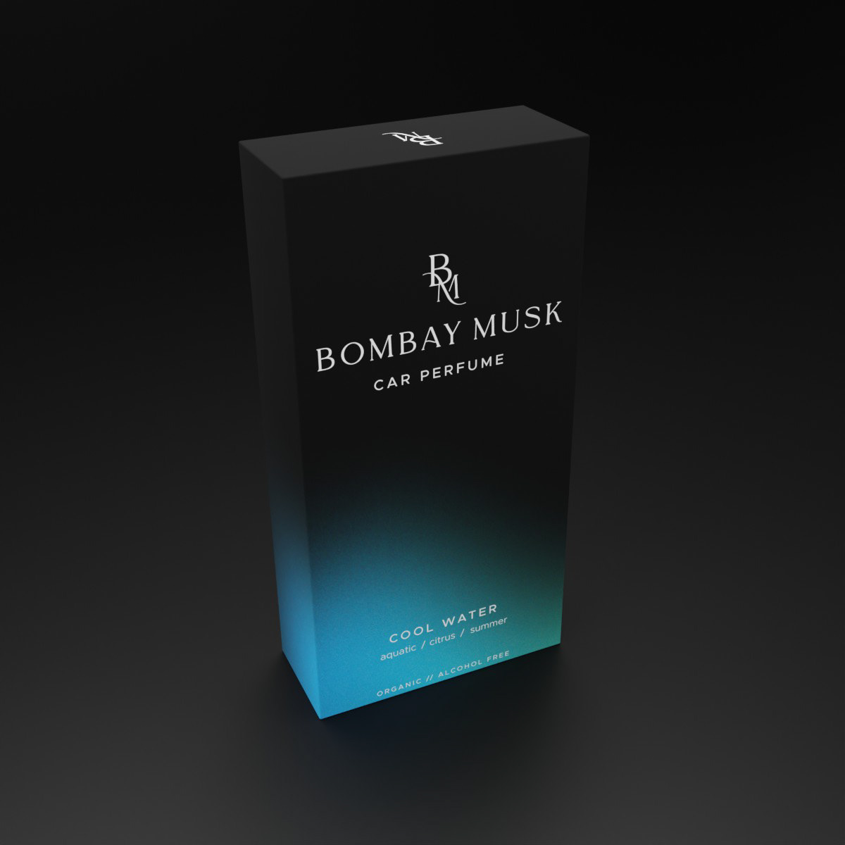
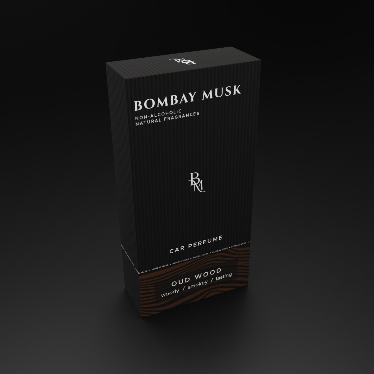
○ 3D Visualization
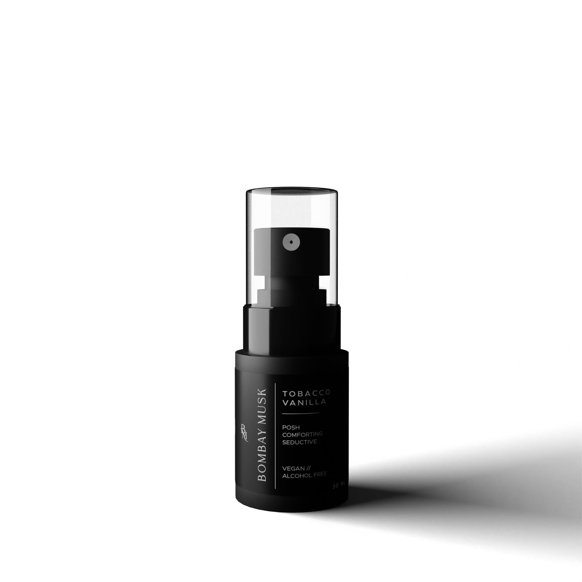
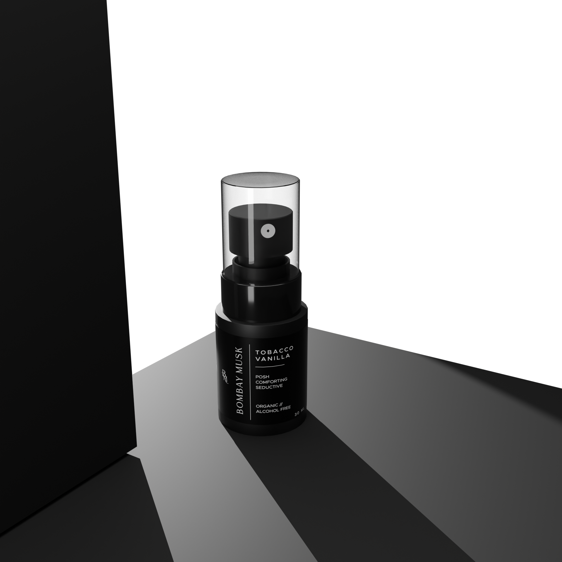
Because product photography wasn’t meeting expectations, 3D mockups were proposed to deliver consistent, premium visuals across platforms.
Because product photography wasn’t meeting expectations, 3D mockups were proposed to deliver consistent, premium visuals across platforms.
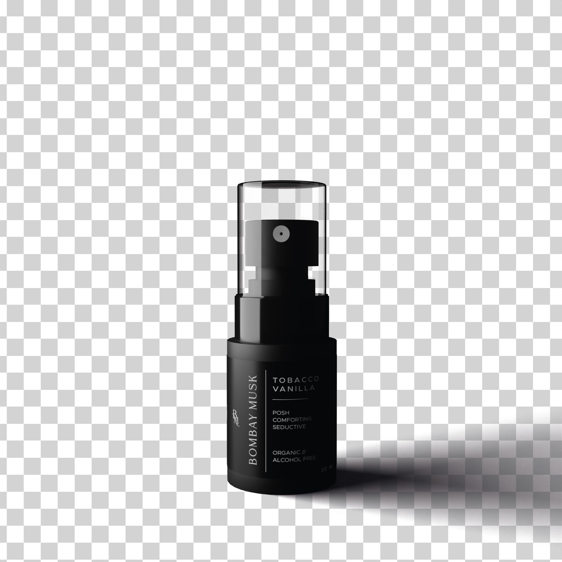
Accurate product images and measurements were used to build the bottle: a flat guide was prepared in Illustrator, then the 3D mesh and materials were developed in Blender for photorealistic results.
To keep the same renders usable everywhere (store, social, marketplaces like Amazon), key outputs were rendered with transparent backgrounds so they can be adapted to different platform requirements quickly.
To keep the same renders usable everywhere (store, social, marketplaces like Amazon), key outputs were rendered with transparent backgrounds so they can be adapted to different platform requirements quickly.
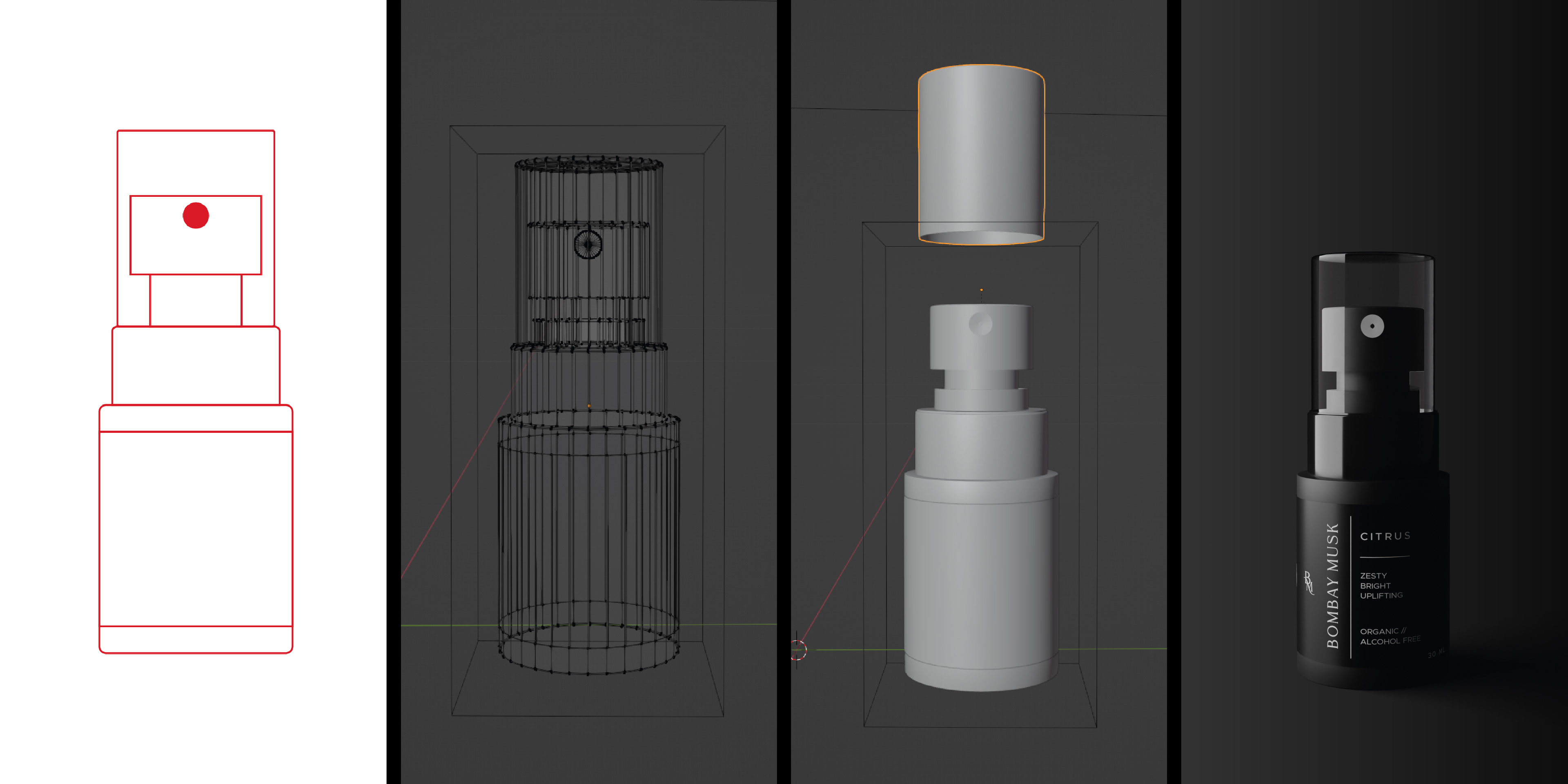
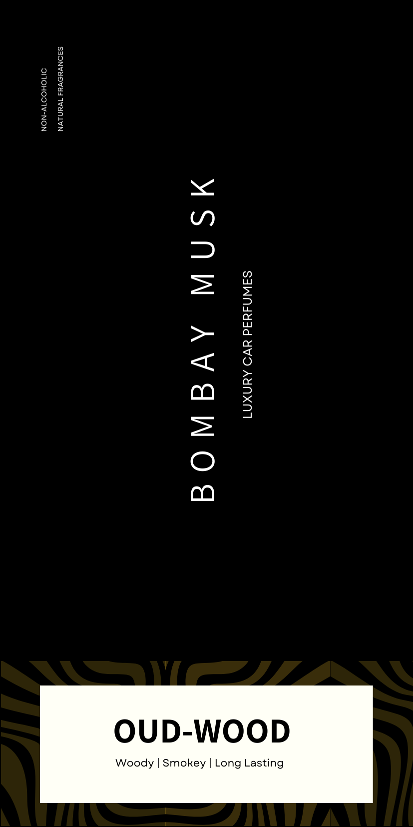
3D Renders