Project brief
Client: Bombay Musk
Deliverables
1. Packaging design
1.1 Printing Dielines
1.2 Outer box packaging
1.3 Bottle label design
1.1 Printing Dielines
1.2 Outer box packaging
1.3 Bottle label design
I was approached by Dr. Robin Sharma to create packaging design and 3D renders for their product.
About the client:
Dr. Robin Sharma, an experienced Ayurvedic doctor, has spent years prescribing Ayurvedic medicines from various brands. Now, he’s taking the next step by launching his own brand. To bring this vision to life, he requires a thoughtfully designed product packaging for his Men’s Energizer Pills
Dr. Robin Sharma, an experienced Ayurvedic doctor, has spent years prescribing Ayurvedic medicines from various brands. Now, he’s taking the next step by launching his own brand. To bring this vision to life, he requires a thoughtfully designed product packaging for his Men’s Energizer Pills
Project Scope:
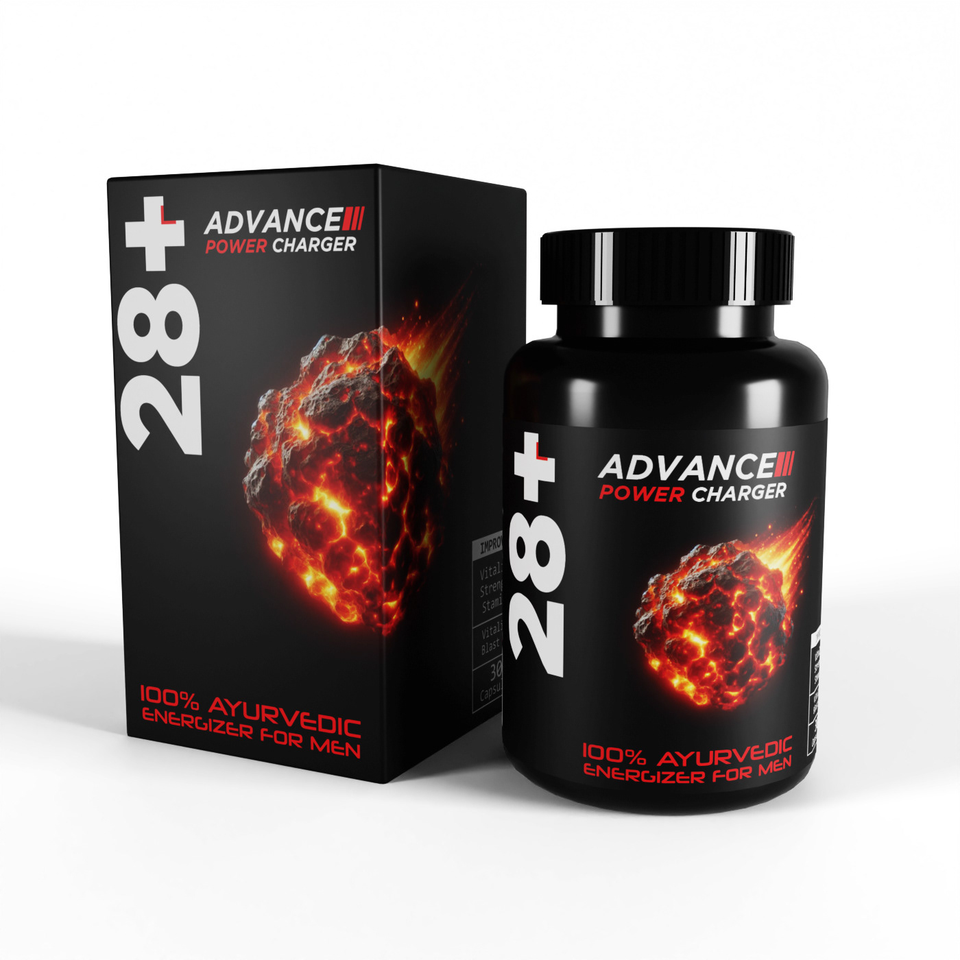
The scope of the project was fairly straightforward, as the client primarily needed a packaging design for their product. However, since I had recently started learning 3D modeling, I decided to include free product mockups as an added value.
Understanding the project:
The product I worked on was men’s vitality pills, specifically targeted at men dealing with fertility issues, a sensitive topic that required thoughtful handling.
The concept behind the packaging design can be summarized by the Hindi proverb, "बिना कहे बहुत कुछ कह जाना" (which translates to "saying a lot without saying anything"). This guided the entire approach, aiming for a design that subtly conveyed the product's purpose to those who needed it while maintaining discretion for others.
The packaging needed to strike a balance: it had to be relatable and reassuring for men facing this challenge, yet understated enough to ensure privacy and avoid drawing unnecessary attention.
What is Ayurved? (optional read)
Ayurveda, is an ancient Indian system of medicine, rooted in the principles of balance and harmony between the body, mind, and spirit. It emphasizes natural remedies, lifestyle changes, and holistic practices to treat and prevent illnesses. Many Indians opt for Ayurveda over allopathy due to its reliance on natural herbs, minimal side effects, and a focus on addressing the root cause rather than just the symptoms. Additionally, Ayurveda's deep cultural and traditional significance instills trust in its methods, especially for chronic conditions where long-term allopathic treatments might pose challenges.
Creating the Dielines
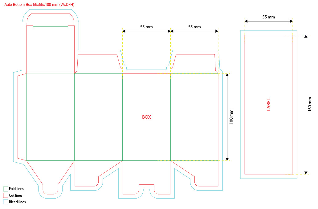
As always, I began this packaging design project by creating the dieline, as it provides a structured canvas to work on. The packaging was a straightforward rectangular box with an auto-bottom design, making it both functional and easy to assemble.
Creating the Design
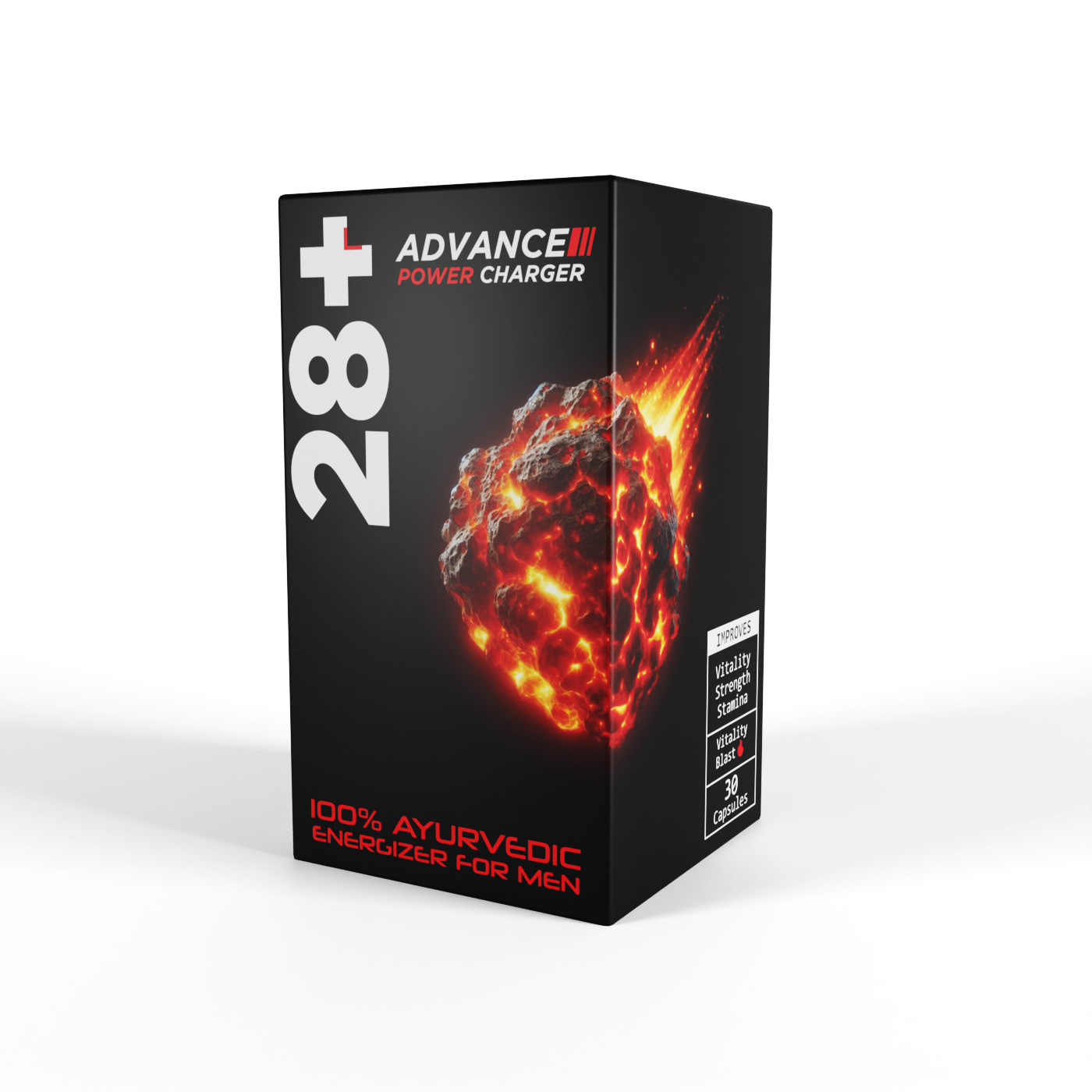
It was time to begin the design process, and the first step was deciding on the colour scheme. The client wanted either a black or white base. Since we had already planned to use a white base for a future project, which would be more fitting for that product, we decided to go with a black base for this one.
My goal was to keep the colour palette minimal to ensure that the hook image would stand out and grab attention. Using too many colours could detract from its impact, so simplicity was key.
I applied the 70/30 rule in this design, a principle I follow when incorporating a hook image in product packaging. This rule suggests that 70% of the design should be kept understated, while the remaining 30% can be more engaging, directing the viewer's focus to the most critical elements.
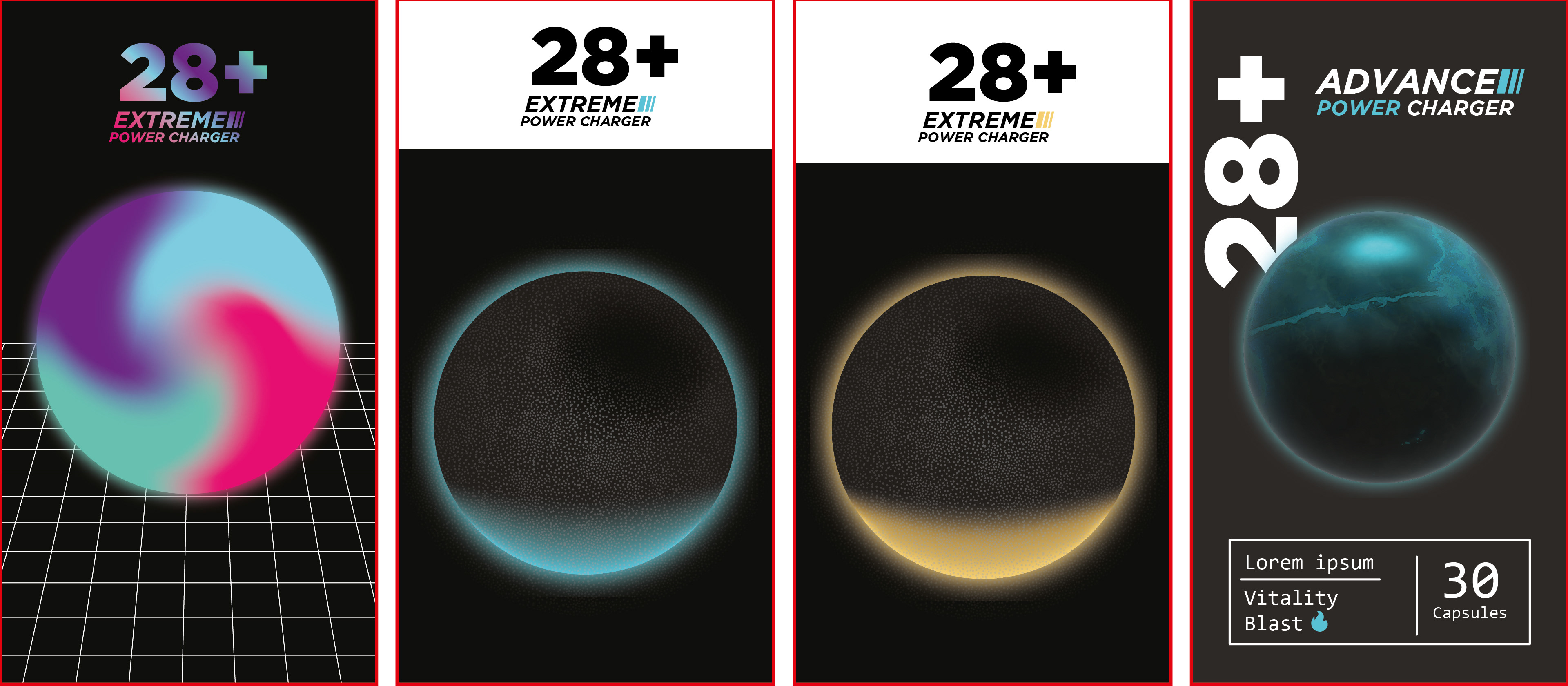
I spent a considerable amount of time experimenting, and here are some of my initial designs for the front of the packaging. At this stage, the spheres in the center were placeholders meant to be replaced by a hook image, which I hadn't finalized yet.
The placeholders, I used are 3D orbs that I had created while experimenting in Illustrator the previous day. Since the product was named "Men's Energizer Pills," I initially thought of designing energy orbs, hoping that inspiration would strike and I could create a meaningful connection between the concept and the product.
And the inspiration strikes...
It struck me like a comet falling from the sky 😉
But before I could work on the hook image, I wanted to complete the rest of the design so I could figure out how much space I could make for it on the front.
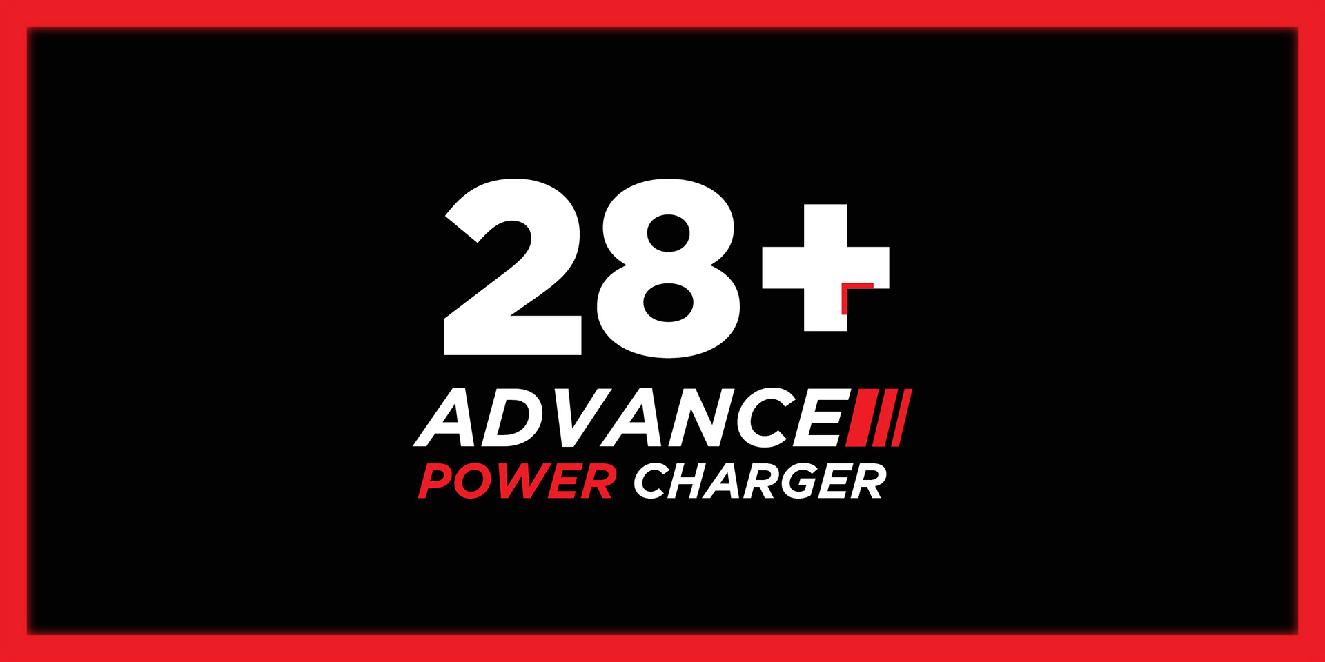
After spending some time refining the design, this was the layout and color scheme I finalized.
I chose red as the accent color because it symbolizes energy and fire, perfectly aligning with the product's purpose. Additionally, I opted for a space-themed typography, the reasoning for which I’ll explain shortly.
To add a unique touch to the packaging, I planned to position the hook image at the intersection of the front and left panels. This placement would give the design an extra edge and make it visually more dynamic.

Creating the hook image
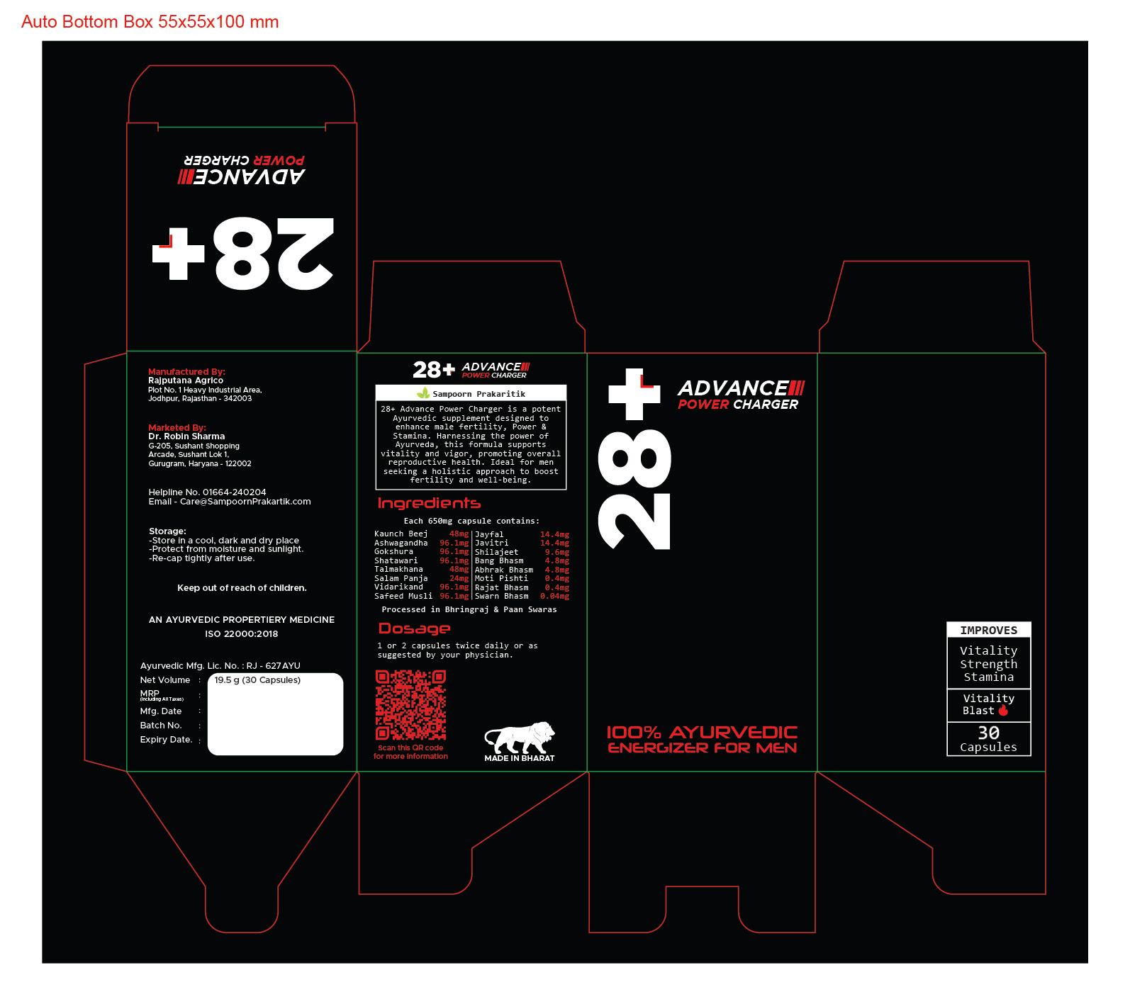
For the hook image, I decided to use a burning comet falling from the sky, as it was highly fitting for the product’s purpose.
In the Indian context, a comet is referred to as "Dhoomketu" in Hindi, a term also used metaphorically to describe a man brimming with vitality and sexual energy, a man at his peak mental and physical form. This symbolism perfectly aligned with the essence of the product, making it an ideal choice for the hook image.
Now that I had the idea and a clear vision, the next step was to create the image I had in mind. To do this, I turned to an AI image generator. It took some time to figure out the exact prompt that would accurately convey the image I envisioned to the AI, but after a few rounds of refining the prompts, I was able to generate an image that was close enough to what I had in mind. I then imported the image into Photoshop, where I made the necessary adjustments and edits to finalize it for use on the packaging.
This project was both challenging and incredibly rewarding. Bringing together the concept, color scheme, and unique hook image required careful thought and experimentation. Despite the challenges, the process was so much fun, and I really enjoyed the creative journey. It was one of those rare projects where everything came together in a way that was both satisfying and exciting, making it a truly one-of-a-kind experience.
To top it off, the client ended up loving the design and even sent me the product as a gift as a gesture of appreciation, making this a truly rewarding experience.